I recently had a whole week to work on my dissertation. Each day I wrote my
thoughts at the beginning of the day and a short To Do list. I thought I would
share as it is a small glimpse into the process of writing a large scholarly
work.
Monday, July 11, 2016
Today I worked on
– flow and structure of Chapter 1, part 2.
– take out all of the passive voice in chapter 1, part 2, and parts of the
Introduction.
– Export parts of the Intro and Chapter 1 to Word document to send to
committee.
Didn’t finish going through:
– flow and narrative of Research Question and Argument sections of the
Introduction.
– flow and argument of Chapter 1, part 2, to see if it fits section
conclusion.
Tuesday, July 12, 2016
I should read through the chapters about the prisoners to see if they actually
uphold my new argument…
To do today:
– Read Introduction for flow and narrative. Check for grammar, argument, etc.
– Read Chapter 1, part 2 for flow, narrative, grammar, and to see if it fits
the conclusion of that section.
– Format and send it to committee.
Need to research:
– which historians argue that “Vernichtung durch Arbeit” was selectively
applied, and which do not.
Wednesday, July 13, 2016
Maybe I should just roll Chapter 1, part 1 into part 2 and not have parts.
To do today:
– Read through Koel book on history of the SS.
– Start reading Langerich’s biography of Himmler (decided to get the English
version for the sake of time).
– Read through Chapter 3 to see if my new argument is supported
– Notes while reading:
– Clarrify argument for the chapter and rewrite the chapter introduction.
– Use available works about the Neuengamme KL when discussing the
Neuengamme KL
– Address the vast literature about the Holocaust and KL research. Put
the most important in a big footnote.
– Passive voice should be removed!
– Prison Infirmary section: Add wordage that talks about how the SS did
not care for the inmates and wanted them to die.
– Technical writing point: Add @ to the end of the Zotero source when
citing multiple sources. Then in Word, search for '.@' and replace with ','.
Thursday, July 14, 2016
Really frustrated and depressed about the dissertation today. I don’t think I’ll
get it finished, and I don’t care to work on it anymore. I don’t think I’ll get
the argument right. I probably can’t justify/support the argument based on the
research I have already done, and I can’t handle any more research at the
moment. It’s never enough! (This song comes to mind: https://youtu.be/37tzsSP-Dc0)
Well, suck it up, quit whining (elitist, 1st world problems) and get back to
reading through Chapter 3.
Notes while reading:
– At beginning of Prisoner Hierarchy section, discuss why important and what
it shows about SS ideology vs. economic drive.
– Do this for each section.
– Prisoner Hierarchy section:
– Make note that this camp used similar hierarchy as other camps. Self
regulating inmates.
– Section on hair: provide more analysis. What did the different hair cuts
mean?
– Letters and packages section: Show that Danish were privileged because
they were the only ones allowed to send and receive letters and packages.
Friday, July 15, 2016
So, good news back from the committee which means I’m in good spirits again.
What I did was actually good and acceptable. So now, moving on. Some thoughts:
– Perhaps just merge part 1 and part 2 of chapter 1.
– Maybe leave Chapter 3 and 4 as is with a clarification or argument that the
survivor voices should stand on their own. Then a fifth chapter analyzing
them?
To do today:
– Read through Spoerer book, to say that I have and footnote it, shows basics
of SS history. Found really good article by Spoerer with discussion about
defining the terms forced laborer, foreign laborer, slave laborer, and
less-than-slave laborer. Use this in Chapter 1 instead of the confusing
paragraph I had before.
– Merge part 1 and 2 in Chapter 1. (not done yet)
– Write up this weeks notes as a blog post (done a few days later)
– Format Chapter 1 and update the dissertation website (not done yet).
How to write in Scrivener and display in HTML, Markdown, ODT, or Doc and keep the footnotes and images.
This is the process I use for getting my chapters out of Scrivener and formatted into Markdown and HTML for putting on the web. Markdown for Github, and HTML for a static website, and Doc for turning in to advisors and the Library.
Write it
Use Scrivener to bring all of the notes and sources together in one place.
Note it
The process of writing actually begins while reading through books and looking at original source documents. For each source (whether book, document, image, or web page) I create an entry in Zotero. With an entry in Zotero, I create a child-note for that entry and take notes in that child-note. I always include the page number in the notes for easy referencing later. A typical note for an entry in Zotero looks like this:
Kaj Björn Karbo (July 4, 1920)

{ | Karbo, 1947 | | |zu:312:A6J3JADD}

page 1,
1400 men were supposed to wash in half and hour at 20 faucets.
Longest roll call was 4 hours because a couple of men had escaped.

page 2,
Relationship to Kapos was bad, also to Russians, and somewhat so to other nationalities.
Kapos were German, Russian, Polish and Czech

page 3,
Punishments consisted of beatings with boards from a bed and truncheon.
Stretched over a bench and held by four men and then beat

page 4,
Was part of many different work commands. In January 1945 was Schieber,
the lowest rung of prison hierarchy. He was in charge of a 16 man work
gang. they helped German civilian workers build a factory for synthetic fuel.
The part in curly braces { | Karbo, 1947 | | |zu:312:A6J3JADD} comes in handy later when adding citations in Scrivener.
Compose it
With all of the notes taken (for now, it can be a never ending process), copy and paste the relevant notes in the correct section of the Scrivener outline. Basically, each idea gets its own ‘page’. This boils down to each paragraph, more or less, on its own ‘page’.
Export it
First step is to export the chapter from Scrivener.
Export it as the OpenOffice (.odt) format. Give it a name like chapter2.odt.
Scan it
To get the footnotes into the correct format (MLA, Chicago, etc), we’ll scan the .odt file with Zotero. This creates a new file.
Open Zotero, click the gear, and select ‘RTF/ODF Scan’.
Select the file you created above (chapter2.odt).
Create a new name and place to save it (chapter2-citations.odt)
Cite it
The Zotero scan converts all of the coded citations from Scrivener into ‘normal’ citations.
from this: { | Blanke-Bohne, 1984 | p. 16 | |zu:312:KMQEIBU0N}
to this: Blanke-Bohne, 1984.
To get it into a different citation style, we’ll open up the file in LibreOffice and change the citation style using the Zotero ‘Set Document Preferences’ menu.
from this: Blanke-Bohne, 1984.
to this: Blanke-Bohne, Reinhold. "Die unterirdische Verlagerung von Rüstungsbetrieben und die Aßuenlager des KZ Neuengamme in Porta Westfalica bei Minden." Dissertation, University of Bremen, 1984.
After the changes finish (could take a while), then save the document as a Word, make sure to do a ‘Save As’ .docx file (chapter2-citations.docx).
Fix it
Only the .docx format is supported by pandoc for extracting images, so we’ll need to use Word as the final format before converting to Markdown and HTML. Frankly, it also has much better grammar and spell checking.
Open the .docx in Microsoft Word and fix up any formatting issues.
I also turn this version in to my advisors for review.
Convert it
In the terminal, we’ll use the pandoc command to convert the file to Markdown and HTML.
This will convert the .docx file to a markdown file, extracting the images and putting them in a ‘files/media/’ directory.
The images are named incrementally in the order they are encountered in the document. The images are given a default name, keeping the extension. If I had four images in the file (two jpegs, one png, and one gif), they would be extracted and named like so: image1.jpeg, image2.jpeg, image3.png, image4.gif, etc.
We’ll have to go in and fix the tables and check for other formatting issues.
This creates an HTML file with the images linked to the files in the files/media/ directory and the footnotes converted to hyperlinks.
Version it
Now these files can more easily be tracked with a versioning system, like git, and the HTML files can be uploaded for a static website version of the
dissertation. Styling can easily be applied if used in a Jekyll site.
For sharing on Github, there are two repos, main and gh-pages.
main repo
The main repo is simply the chapter directories with each of the document versions and the extracted media files. Once edits and conversions are done, this is updated with a simple
The gh-pages repo contains the files needed to convert the html version of the doucments into a Jekyll based static website. The trick here is to get all of the updates from the main repo into this gh-pages repo. This is accomplished with doing the following command while checked out in the gh-pages branch.
```
git checkout master -- chapterX
```
Before I can push the new changes to Github, I’ll need to fix a few things in the html version of the chapter.
First is to add some YAML front matter. I add this to the beginning of the HTML version.
---
layout: page
title: Chapter X
---
Second, update the path for the images so that they will work. I open the file in Vim and do a simple search and replace:
:%s/img src="files/img src="..\/files/g
Now I can update the gh-pages branch and the site.
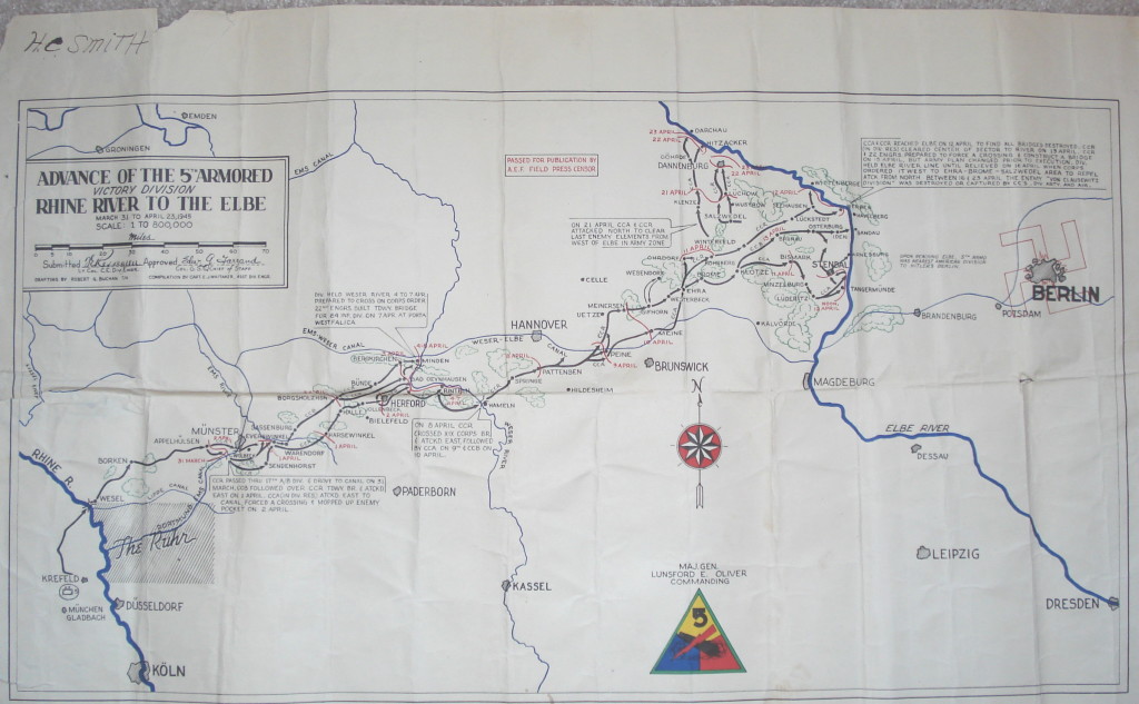
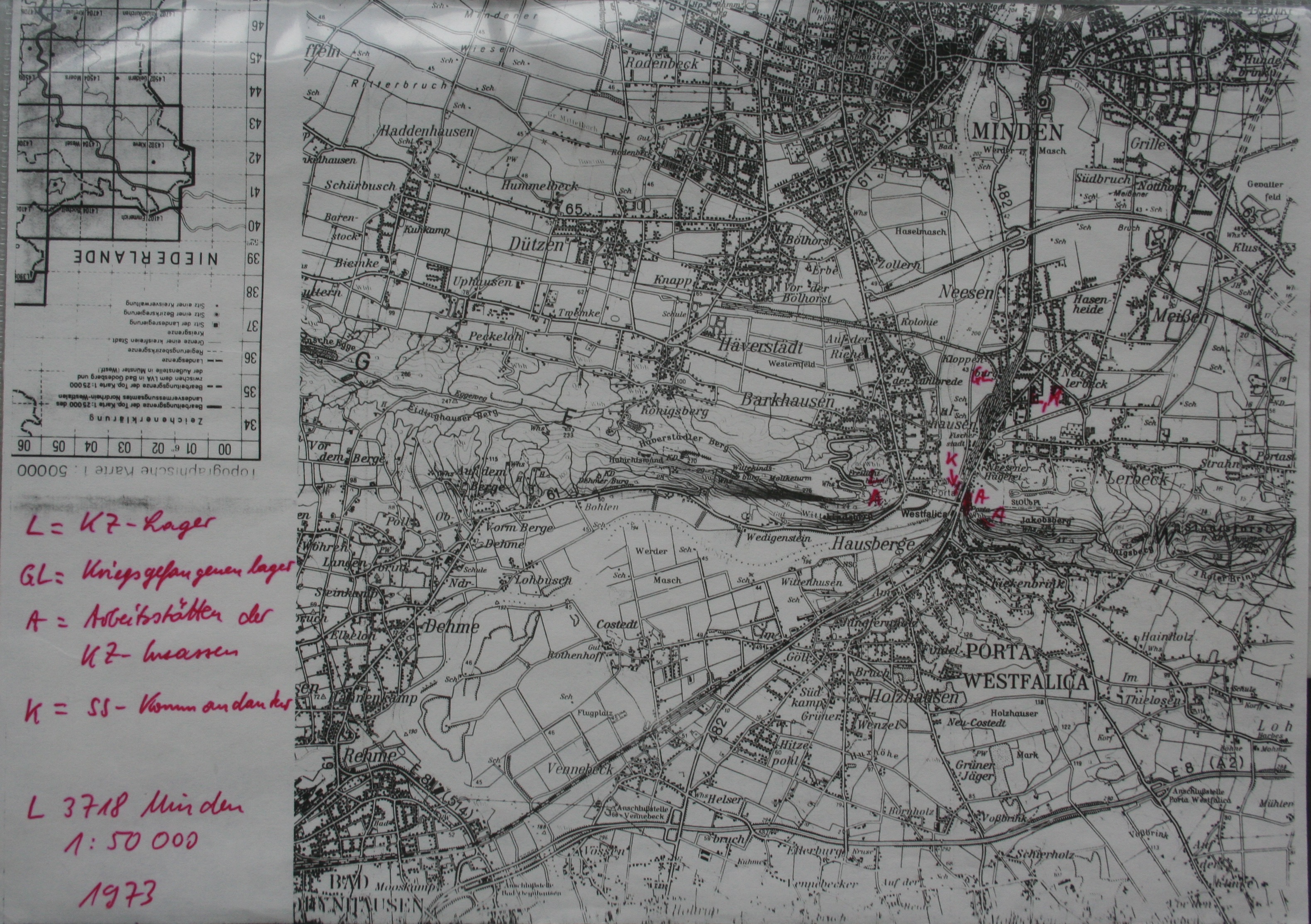
I was looking through some after action reports from the U.S. military groups that entered the Minden, Porta Westfalica area in early April 1945. The reports come from 5ad.org, an unofficial site dedicated to the 5th Armored Division in WW2, and the Combined Arms Research Digital Library (http://cgsc.contentdm.oclc.org/cdm/landingpage/collection/p4013coll8). The best find so far was the map showing the path of the 5th Armored Division as they swept through Germany.
I was hoping to get information about the discovery of the underground factories, but the detail, so far, has been at a much higher level… this company moved here at this hour, and this company here, etc.
It was interesting to mentally plot the course of these military groups as they approached and left the area I was interested in. For the most part, I could just type the town’s name into Google Maps to pull up the location, but I noticed what seemed like coordinates listed sometimes as well.
That got me curious to see if there was a way to locate these coordinate points. I searched Google for “ww2 german map coordinates” which led me to this post (http://forum.axishistory.com/viewtopic.php?t=158724) at the the forums at axishistory.com, which led me to this site (http://www.echodelta.net/mbs/eng-welcome.php) that converts old ww2 coordinates to locations in Google Maps.
The system in use at the time uses a grid over northern Europe with a letter pair to distinguish each grid square. Within that square, a set of numbers determine the kilometers on the x and y axis to travel to reach the correct point. I had to guess which grid was used, since the coordinates were just numbers. It worked out well.
Visual representations of data offer a quick way to express a lot of information. As the old adage goes, a picture is worth a thousand words. One of the facets of digital humanities research is providing information in the form of visuals: graphs, maps, charts, etc.
I was already writing up some notes on a visualization I was creating for the dissertation when I read this excellent blog post by Fred Gibbs (a version of a presentation at the AHA 2015). In this essay I think Fred accurately identifies the digital humanities field as one in need of stepping up to the next level. It is no longer enough to present visuals as humanities research, but it is time to start critiquing what is presented, and for researchers to start explicitly explaining the choices that went into creating that visualization.
With those thoughts in mind, I present the methodology, the decisions, and the visualization of over 200 deaths at the KZ Porta Westfalica Barkhausen, during a one year period.
A change is happening (at least for me) in how data is analyzed. I have a spreadsheet of over 200 deaths, with various information, death date, location, nationality, etc. The desire to create a visualization came from wanting to understand the data and see the commonalities and differences. The first question I had was how many nationalities are represented, and which countries. The second question is what is the distribution of the deaths by month.
The following is how I came to a visualization that answers the first question.
Data Compilation
Data is taken from two locations and merged.
The first set of data is a large spreadsheet obtained from the KZ Neuengamme Archiv containing all of their data on the prisoners that died and were at KZ Neuengamme or one of the satellite camps. This file contains 23,393 individuals.
The second data set is another set of files from KZ Neuengamme Archiv, but is derived from a list compiled by French authorities. It is available online at: http://www.bddm.org/liv/index_liv.php. The files were split into three sections listing the dead from Barkhause, Porta Westfalica, and Lerbeck. These files contained a total of 177 individuals.
Combining just the individuals matching those who were in a Porta Westfalica KZ from both sets of data left around 280 individuals.
Data Cleaning
There were a number of steps needed in order to have useful information from the data.
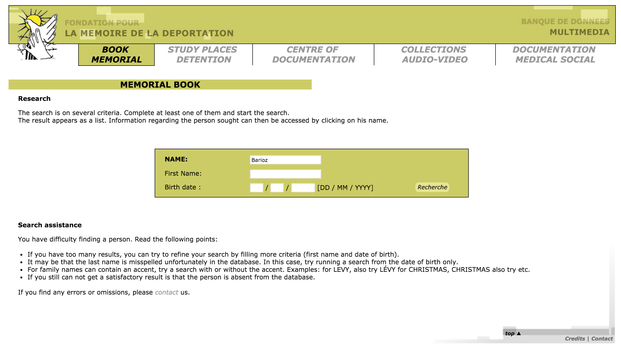
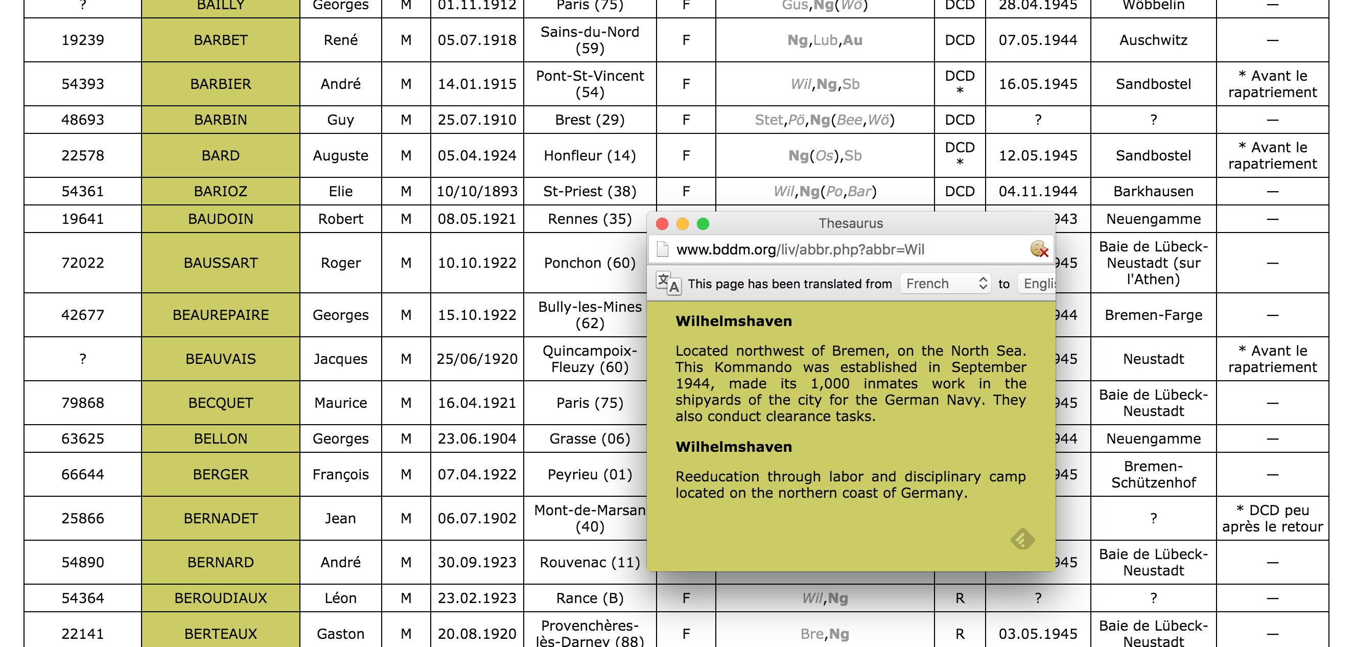
First of all, the data from the French archive was highly abbreviated. For example, the column containing the locations of internment were two or three letter abbreviations of location names. Elie Barioz, for example, had the locations “Wil, Ng (Po, Bar)” which, when translated, turn into “Wilhelmshaven, Neuengamme (Porta Westfalica, Porta Westfalica-Barkhausen)”
The process of translating the abbreviations was quite labor intensive. First, I had to search on the French site for an individual: http://www.bddm.org/liv/recherche.php
Search for ‘Barioz’. Note: The Chrome web browser can automatically translate the pages on this site.
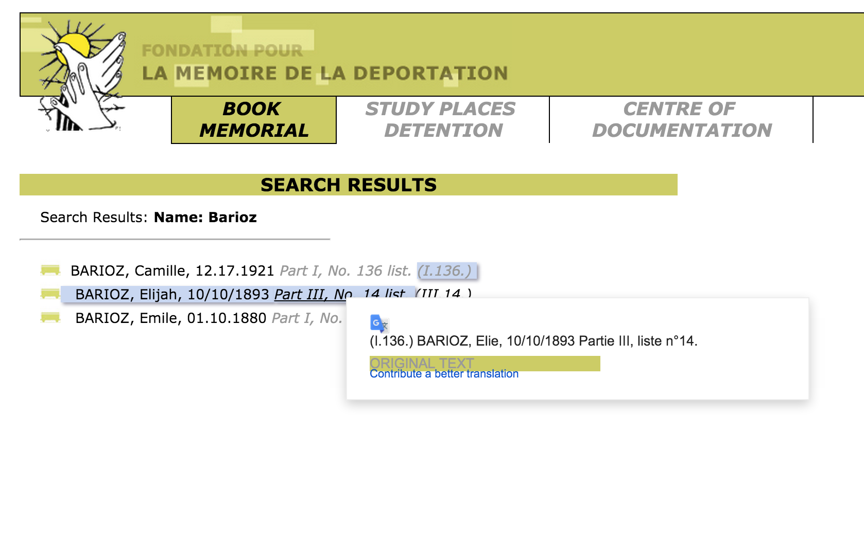
The correct individual can be determined by comparing the full name and the birthdate. The citation to the location in the book is a hyperlink to that record (ex. Part III, No. 14 list. (III.14.)).
The abbreviations for this individual’s interment locations are hyperlinks to more information, part of which is the full name of the location. Clicking on ‘Wil’ results in a pop up window describing the KZ at Wilhelmshaven and information about the city.
After determining that ‘Wil’ meant ‘Wilhelmshaven’, all occurrences of ‘Wil’ in that column can be changed to ‘Wilhelmshaven’.This process is repeated until all of the abbreviations have been translated.
Remove extraneous asterisks. It was quite frustrating to note that the French site did not include information on what the asterisk and other odd symbols mean. (Another odd notation is the numbers in parenthesis after the birth location.) I had to simply just delete the asterisks, losing any possible meaning they might have had.
Combine duplicates. Keep as much information from both records as possible.
Fix dates. They should all be the same format. This is tricky, in that Europe keeps dates in the format MM-DD-YYYY. For clarity sake, it would be best to use “Month DD, YYYY”. I left them as is for now. Editing 280 dates is not fun…
Fix nationality. The Tableau software references current nations. The data in the spread sheets uses nations current to the time of creation. For example, some individuals were noted with the nationality of ‘Soviet Union (Ukraine)’. These needed to be brought to the present as ‘Ukraine’. More problematic were the individuals from ‘Czechoslovakia’. Presently, there is the Czech Republic and Slovakia. The question is, which present day nationality to pick. There is a column for birth place which potentially solves the issue, but this field is for where the individual was born, wich, in the case of Jan Siminski, is seen. He was born in the Polish town of Obersitz (German translation), so the birth place can not clarify his nationality as Czech or Slovakian.
This brings up another issue, the translation of place names. City names in German, especially during the Third Reich, are different than current German names for the city, which are different than the English name of the city, which are different than what the nation calls the city. I need to standardize the names, picking, probably English. Tableau seemed to have no problem with the ethnic city names, or the German version, so I left them as is.
This allows for very quick visuals, and a very easy process. The website has a number of free tutorials to get started. http://www.tableau.com/learn/training
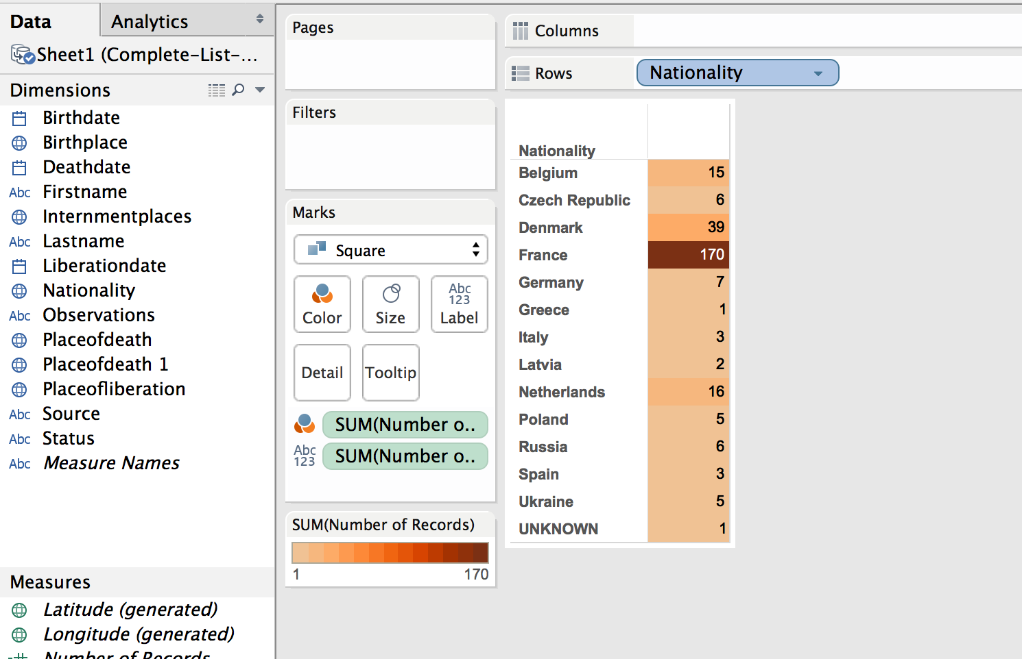
Map
The first visualization I wanted to make was a map showing where the prisoners were from, their nationality. The map would also show the number of prisoners from each country. (This is not a tutorial on how to use Tableau, but a walk through of the pertinent choices I made to make sense of the data, it is methodology, not tech support. 🙂 )
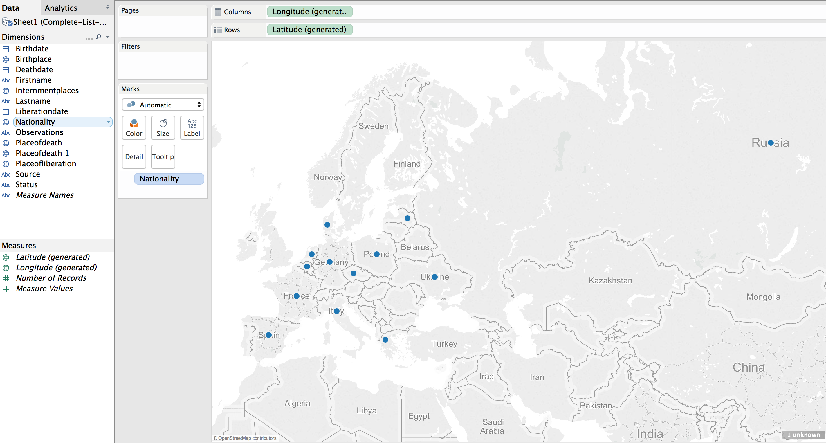
Using the default settings (basically, just double clicking on the Nationality field to create the map) results in a dot on each country represented in the data.
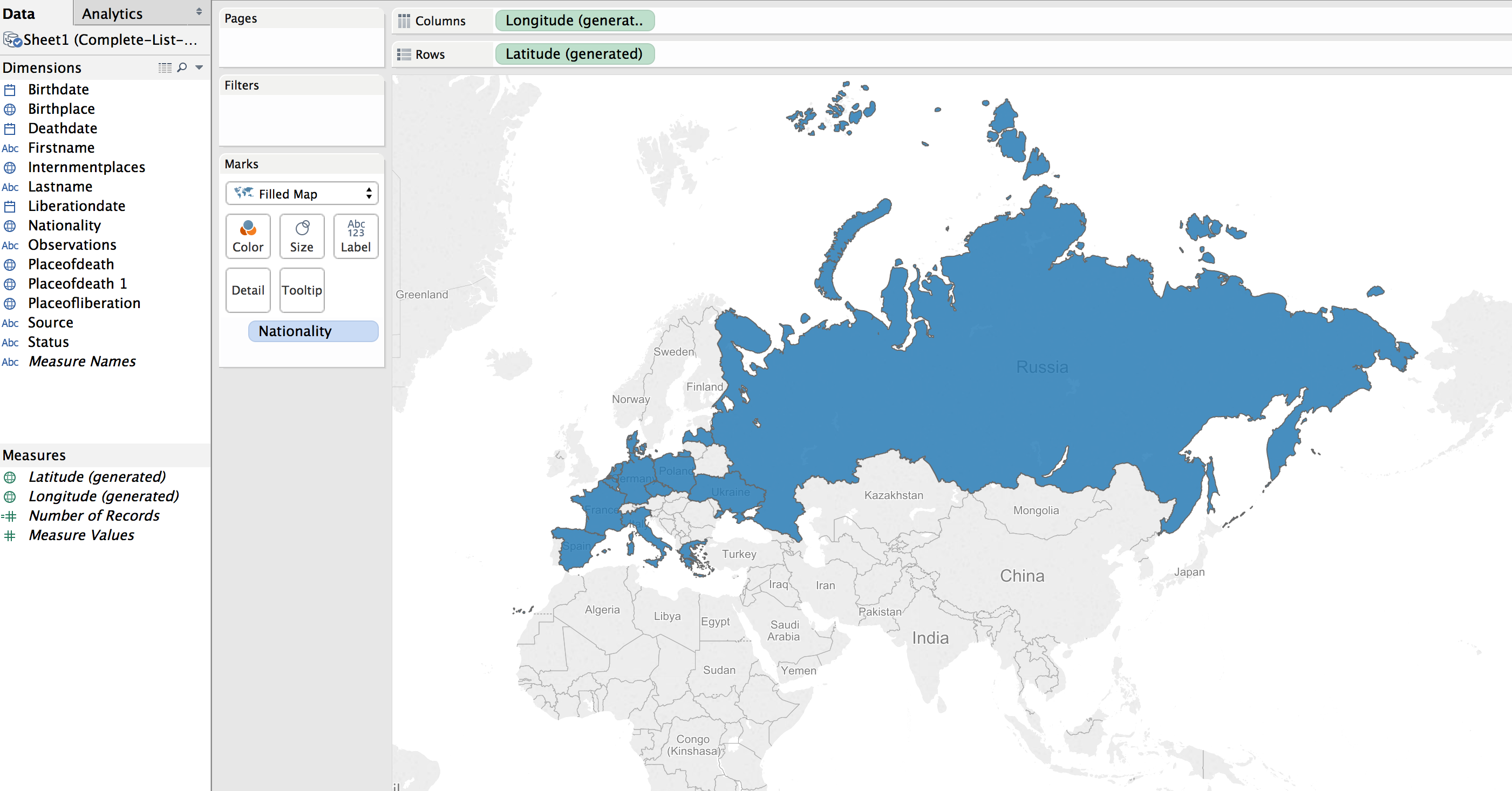
This can be transformed into a polygon highlight of the country by selecting a “Filled Map”.
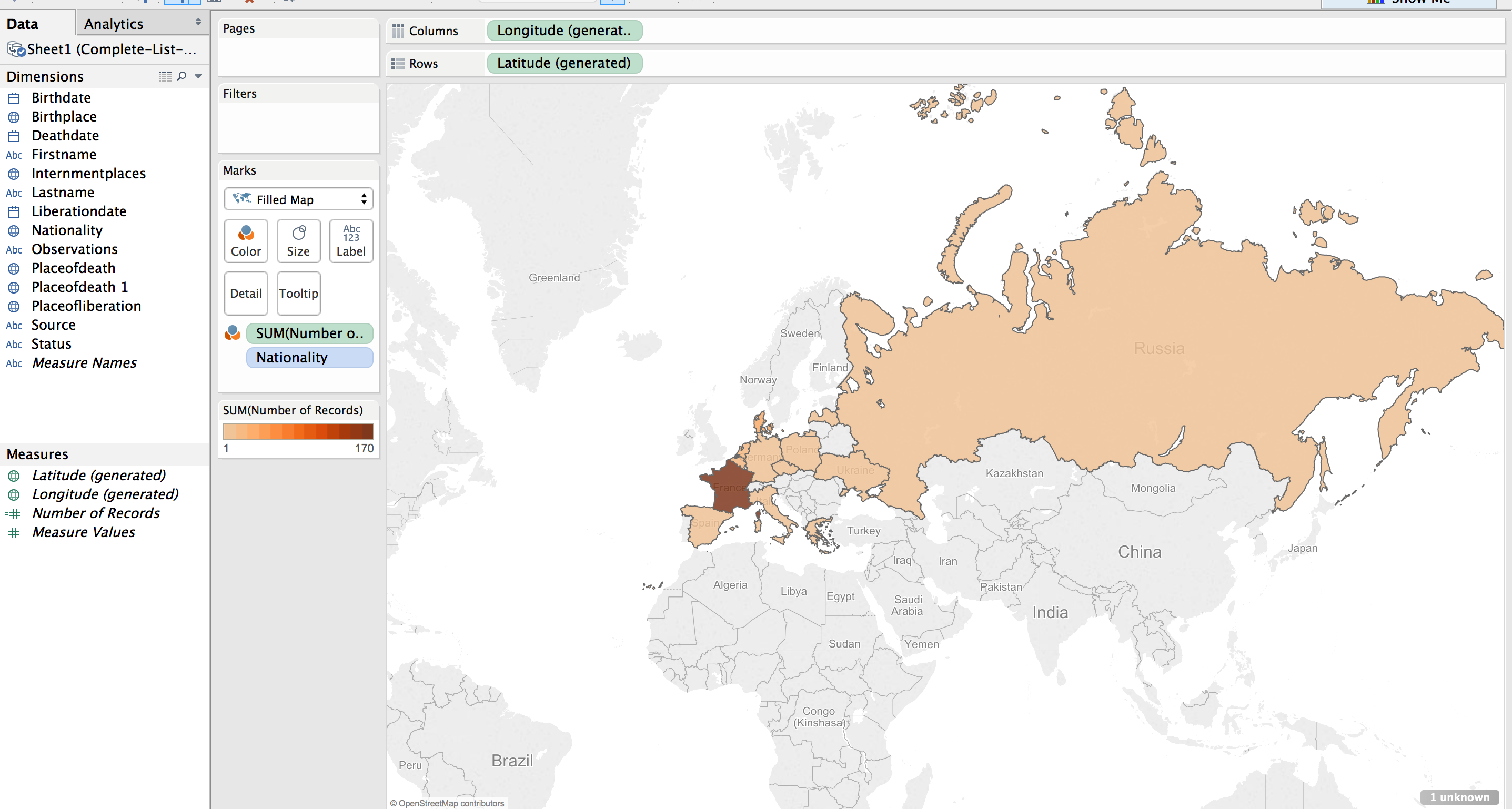
Next step was to apply shading to the filled map; the larger the number of prisoners who died from that country the darker the fill color.
The default color was shades of green. I wanted a more dull color to fit in with the theme of the visualization, “death”. I picked a light orange to brown default gradient, separated into 13 steps (there are 13 countries represented).
Table
While just a filled map with gradient colored countries is helpful, the information would be more complete, more fully understandable, with a legend. This can be created by using a plane table listing the countries and the number of dead from that country. Each row is color coordinated with the map by using the same color scheme and number of steps as with the map.
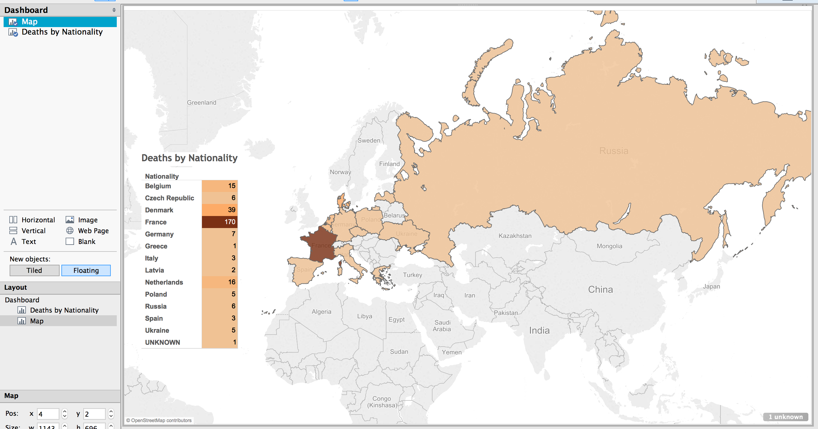
Dashboard
In Tableau, you create a dashboard to combine the different work sheets, maps, tables, graphs, etc. In this case, a full page map, with the table overlaid completes the visualization.
Result
The result is a very simple map, created in about ten minutes (after a few video tutorials to refresh my memory on how to create the affects I wanted).
(See a fully functioning result below this image.)
Benefits of Tableau
Tableau has some limitations. The results are hosted on their servers, which has the potential for lock down. They use proprietary, closed source code and applications.
But there are many benefits. The default visualizations look great. It is very easy to create simple and powerful visualizations. The product is capable of producing very sophisticated statistical representations. You can use the free and open source stats program R. The visualizations are embed-able in any website using Javascript.
The biggest benefit of using Tableau is the automatic link back to the original data source. I think the most needed shift in humanities (particularly the history profession), and the biggest benefit of “digital” capabilities for the humanities, is the ability to link to the source material. This makes it infinitely more easy for readers and other scholars to follow the source trail in order to provide better and more accurate feed back (read critique and support).
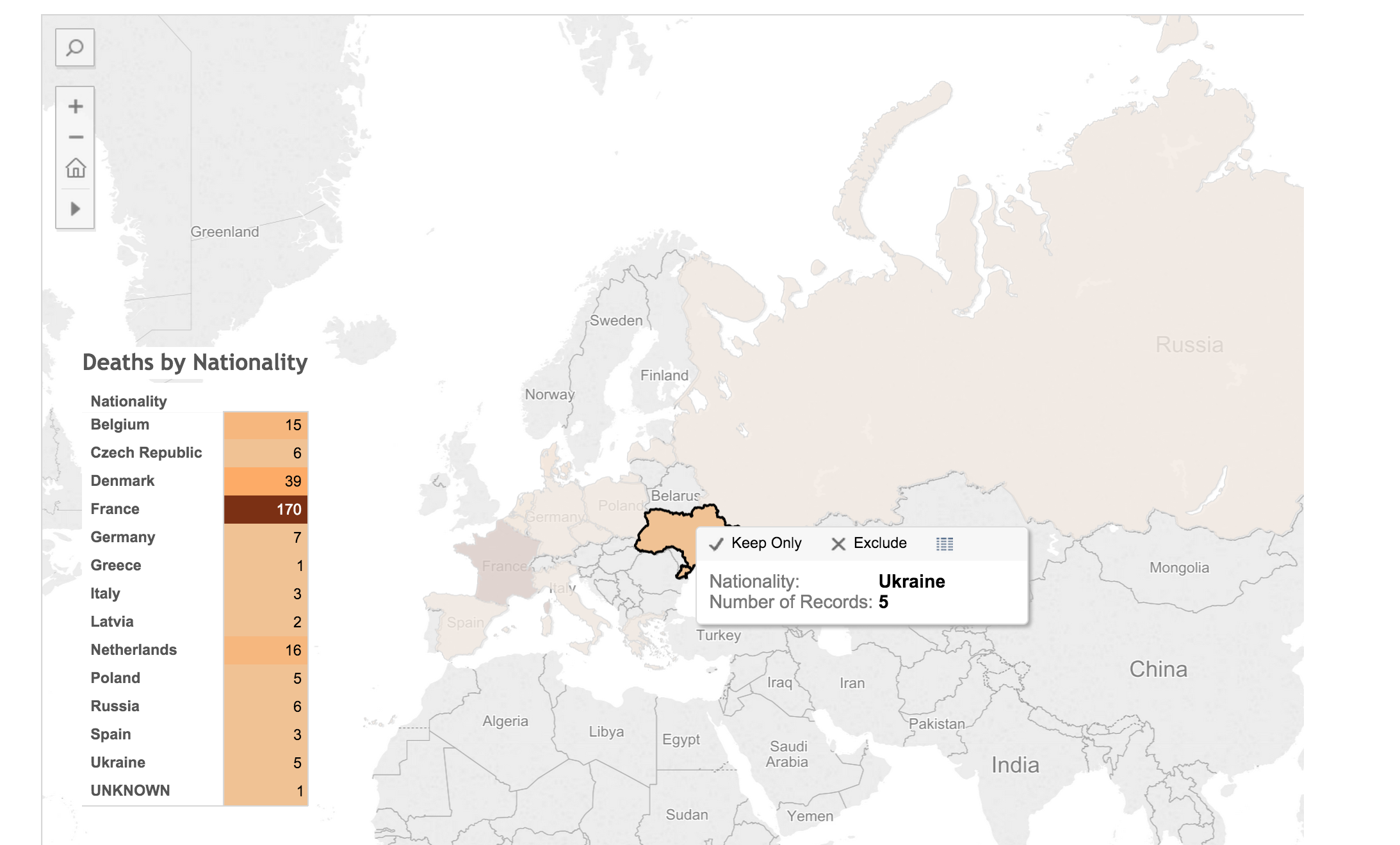
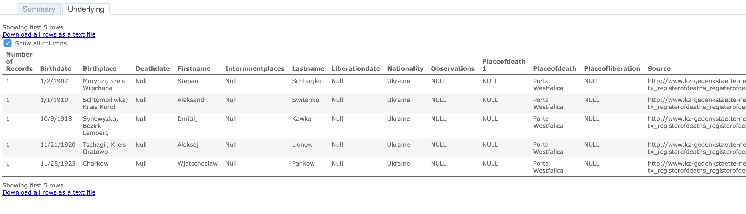
To see the underlying data in this visualization, click on a country in the map or the table. A pop up window appears with minimal data.
Click on the “View Data” icon.
Select the “Underlying” tab and check the “Show all columns” box. Voilà!
Behold the intoxicating power of being able to view the underlying data for a visualization!
Digital Humanities Improvement Idea
Imagine, if you will, the typical journal article or book, with footnotes or end notes referencing some primary document or page in another book or article. With digital media, that footnote turns into a hyper-link. A link to a digital copy of the primary document at the archive’s site, or the author’s own personal archive site. Or it links to a Google Book site with the page of the book or journal displayed. Now you have the whole document or at least a whole page of text to provide appropriate context to citation.
Way too often I have been met with a dead end in following citations; especially references to documents in an archive. Not often, but archives change catalog formats, documents move in an archive, they no longer are available to researchers, etc. It would be so much easier to have a link to what some researcher has already spent time finding. Let’s build on the shoulders of each other, rather than make each scholar waste time doing archival research that has already been done.
I think it incumbent upon all researchers to provide more than a dead-text citation to their sources. In this digital age, it is becoming more and more trivial to set up a repository of the sources used in research, and the skills needed to provide a link to an item in a repository less demanding. Here are some ideas on how to accomplish this already.
Set up a free, hosted version of Omeka at http://omeka.net. Add all of your source material to Omeka. Provide a link to the document in Omeka along with your citation in the footnote or end note.
Create a free WordPress account at http://wordpress.com. Add a post for each source document. Provide a link to that post in your citation.
Most universities have a free faculty or student web hosting environment (something likehttp://univ.edu/~usrname/). Dump all of your digital copies of your documents in that space (nicely organized in descriptive folders and with descriptive file names–no spaces in the names, of course). Now, provide a link to that resource in your citation.
Set up a free Zotero account at http://zotero.org. Set up a Group Library as Public and publish all of your sources to this library.
I intend to take my own advice. I have an Omeka repository already set up, with a few resources there already: NaziTunnels Document Repository. Once I start publishing the text of my dissertation, there will be links back to the primary document in the footnotes.
I would love to see this type of digital citation become as ubiquitous as the present-day dead-text citation.
I have not addressed Copyright issues with this. Copyright restrictions will severely limit the resources to be used in an online sources repository, but there are certainly work ways to work around this.
If hosting the sources on your own, one quick fix would be to put the digital citation sources behind a password (available in the book or journal text). Another option might be to get permission from the archive if only low quality reproductions are offered.
End
Let me know if you find the live-text or digital citation idea viable. Do you have other ideas for providing a repository of your sources?
Drop me a note if you want more detail on how I created the map in Tableau. I’m by no means proficient or in no way the technical support for Tableau, but I’ll do what I can to guide and advise.
I presented the following at the Association of American Geographers Annual meeting on April 21, 2015. I titled the presentation, “Placing Space in the Experiences of Forced Laborers at Porta Westfalica”
What follows is the paper with the images I used in the presentation. This will turn into the presentation I’ll give in Porta Westfalica on May 8, and a journal article this summer, and eventually a chapter of the dissertation.
==========
Location is important for human interaction and growth development. Being able to place ourselves in a location and being able to recall the location of things and events is also critical for our ability to remember. As one psychologist put it, “memory for location is a fundamental aspect of human functioning. Without the ability to remember locations, children and adults would be unable to carry out even basic tasks, such as getting ready for school or preparing a meal.”[1] Indeed, it seems the visual aspect of remembering is integral for recalling memories made with sight. Studies have shown that a person’s memories are affected when they lose their vision, eventually leading to losing memories, “even well-rehearsed and well-consolidated childhood memories, are lost because the relevant visual information, which is a key part of the memory information, is lost.”[2] When vision is lost, the memories made with that vision erode until they are forgotten completely. New memories can and are made, but without the visual component.
Events and experiences are more accurately remembered, and remembered with more detail, when influenced by strong emotional stimulations (such as during traumatic and stressful events). More so, such memories are strengthened by and even depend upon the visual component. During highly traumatic or stressful events the visual awareness is sharpened, hence ones surroundings, ones location and spatial awareness, become more important. Remembering the place helps us remember the event. This is arguably the case for why many holocaust survivors recall so vividly, and invariably include in their autobiographical accounts, the place names of where traumatic events happened.
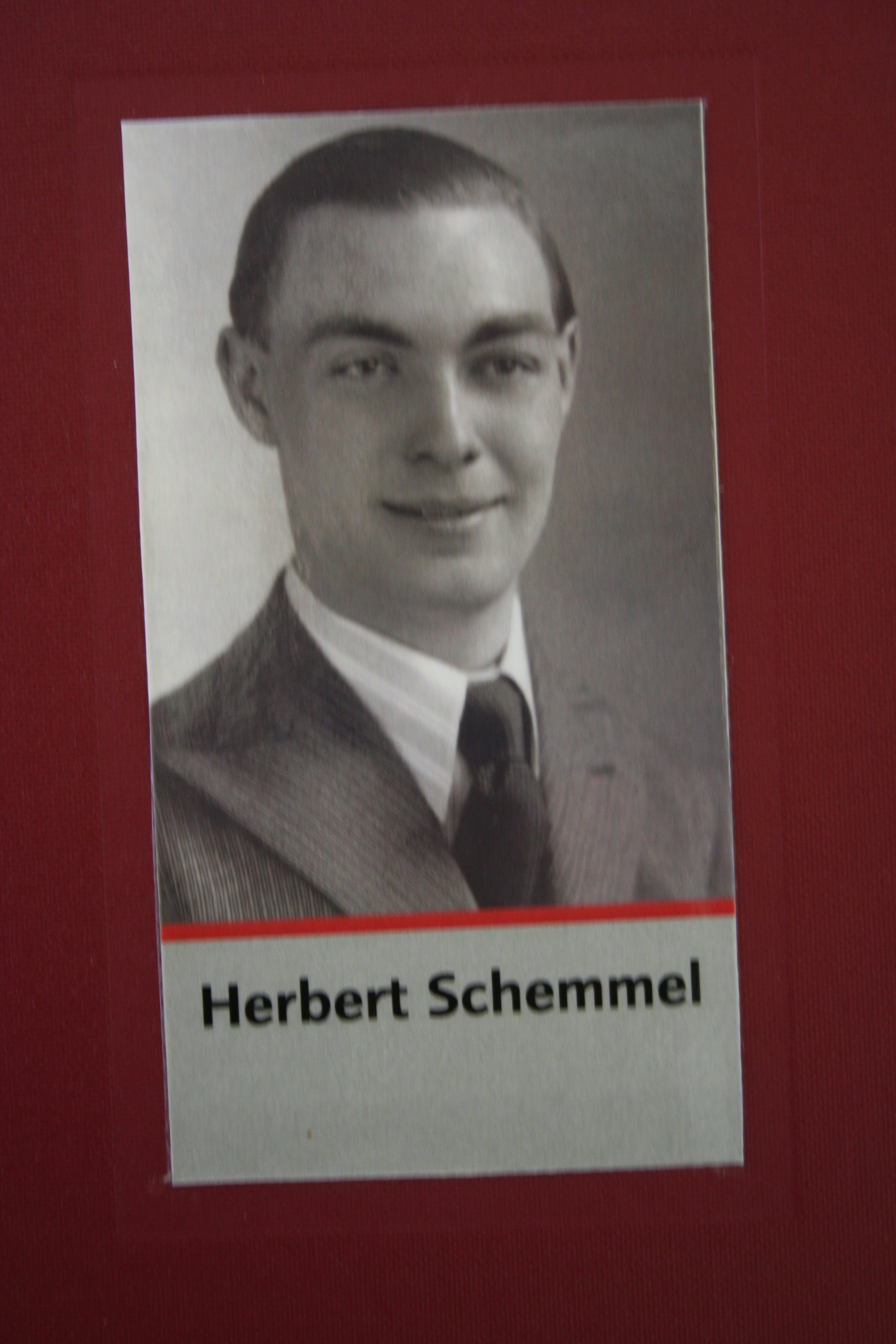
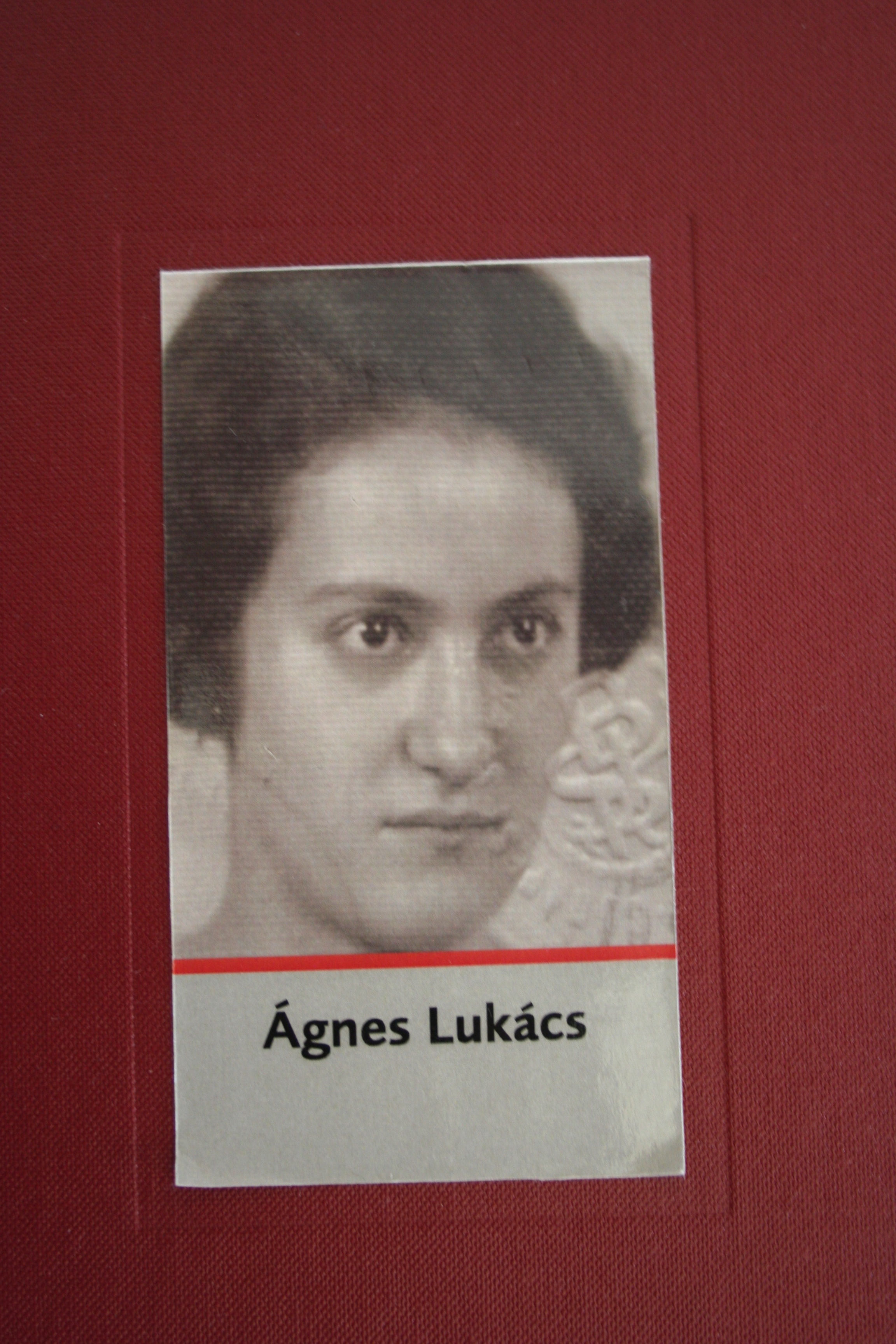
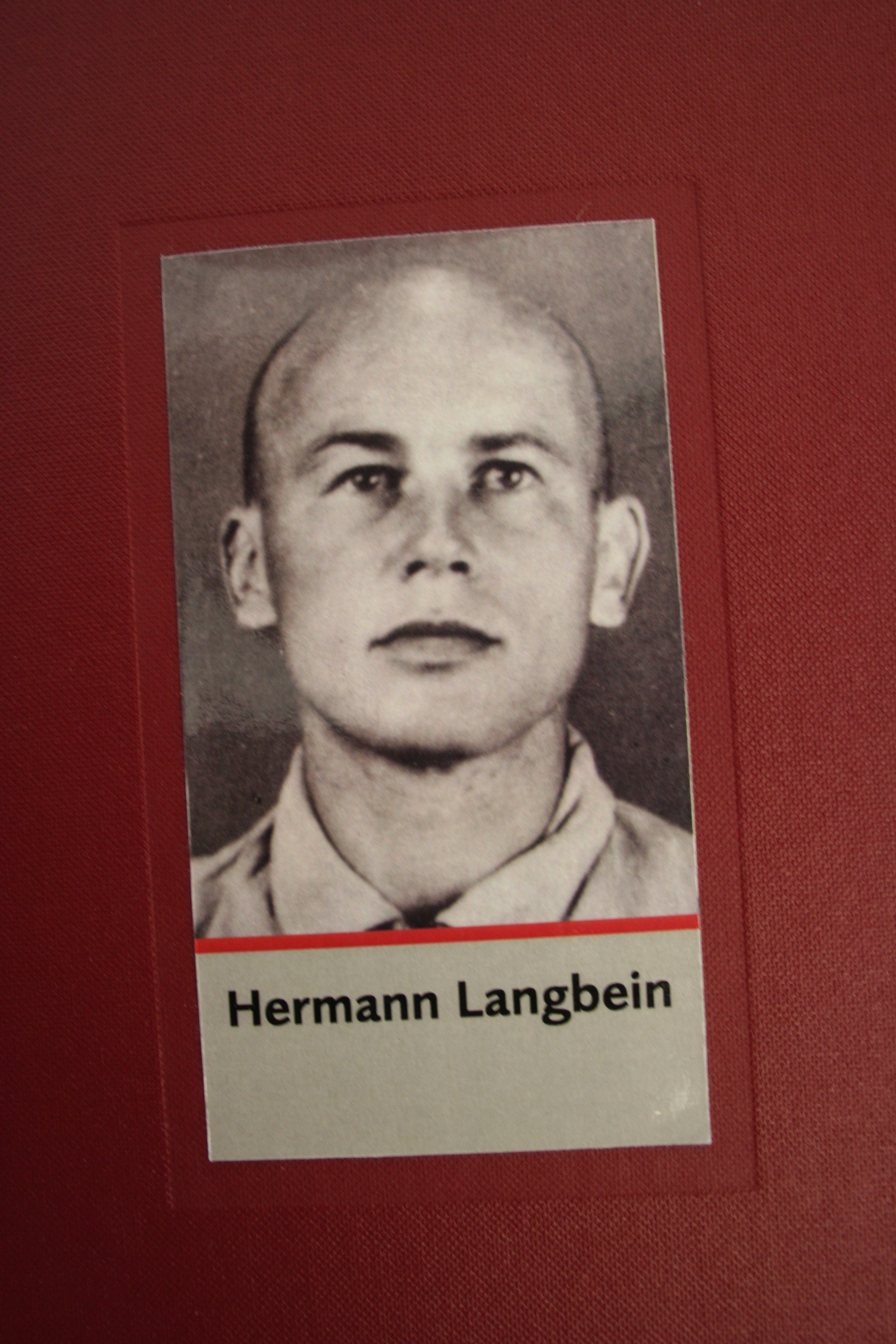
Often, survivors put great emphasis on recalling with the place where seemingly unimportant events happened, like which town they travelled through on the way to a prison camp. Zsuzsa Farago a 24 year old female Jew from Hungary, for example, could not remember the date when she left Auschwitz for a labor camp, but she did remember several details about the location. “I don’t remember exactly anymore, I believe that we were transferred sometime in the Fall. We were taken to Reichenbach. There was a telephone factory there. I believe that belongs to Czechoslovakia today, then there were Germans. Far away from the city there was a camp, and that’s where we were. And we worked in the factory there.” Specific time aspects seem to fade quicker than spatial aspects of memories.
At other times, the survivor’s grasp of the time was just as acute as their location. Eva Gescheid, a 20 year old female Jew from Hungary, described her journey to Auschwitz and later to Porta Westfalica with such detail. “We travelled for four days and nights, unspeakable suffering, because there were 70-80 people transported in closed cattle-cars. There was absolutely no water. After four days we came to Auschwitz… It was March, rain and snow showers raged. We possessed only one blanket each, which provided only a little protection. Six days and nights we traveled and suffered the torments of hell. Finally we reached Porta. We were unloaded and again left without food; this for two whole days.”
Before I even had the data, I wanted to do some kind of spatial analysis. That’s like buying a car just for the experience of changing a tire, or more accurately, putting the proverbial cart before the horse. Nevertheless, I was certain that there was some spatial context to analyze, for everything happens somewhere, and looking at the somewhere can help us understand more about the events. I also had a tendency to focus too much on the tools and methodology, so it was important to remember that the spatial plotting tools and the data points were not the analysis, but only tools used to analyze.
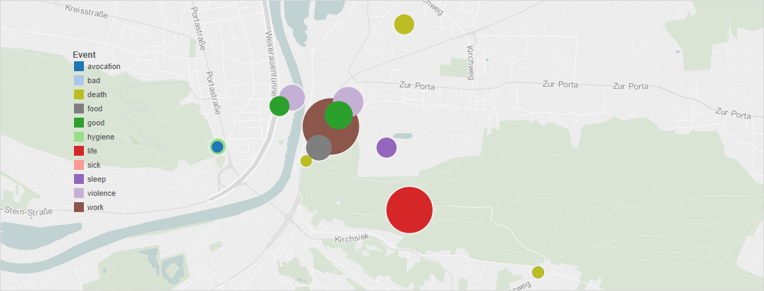
The first step in gathering data was to determine the scope. With hopes of finding plentiful events, the scope was narrowed to focus only on the time that a survivor was encamped at one of the Porta Westfalica labor camps, Barkhausen, Lerbeck or Hausberge, and their accompanying work site. As I began to assemble the data, looking at the interviews and deciding what elements to track, I began to ask questions that I was hoping the data would be able to answer. Some initial questions I had were: Were there more bad memories than good? Or, given the circumstances, were there any good memories? In terms of percentage, which gender had more or less than the other of good or bad experiences? What were the age ranges of the prisoners? Where were the majority of the inmates deported to? Where does most of the violence and death happen?
The final question seemed to have the most potential of being answered once I started going through the data to pull out events. I was also able to find that there were indeed good experiences had in the concentration camp. Only after I gathered the data and began to try different ways of graphing and mapping the data did more questions arise. Most surprising were the number of gender based questions that arose from looking at the data. Some of these questions included the following: Which prisoner had the greatest number of events? Since the number of male and female interviews were comparable (6 female and 8 male), which gender had the greater number of events and why? Was one gender apt to have more experiences with certain events than the other?
Other location-based questions arose as well. Although seemingly obvious, where did the majority of work related, violence, and death events happen? Which location had the most events? I was also interested in seeing what patterns or information stood out that was not anticipated.
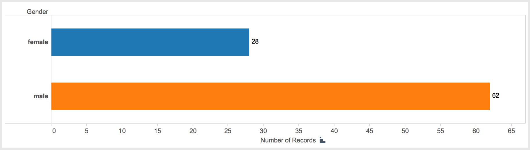
The data points come from an original pool of 25 transcripts of interviews or other written accounts by survivors predominantly taken during the 1990s. Only 14 ended up having events that could be used in this study. While most of the accounts contained plenty of spatial references, only 14 had such references while recounting their time at the Porta Westfalica camps. Females accounted for 6 and males for 8 of the accounts used in this study. A total of 90 events were found in the 14 accounts.
Number of events recorded by gender.
I was hoping the accounts would be replete with retellings of events and graphic descriptions of the locations where they happened. It would have been great if the survivors were able to describe in detail where they were standing at any given point and had a plethora of events to recount. In reality, the events were much more general and quite vague. Instead of someone describing where exactly in the camp or tunnel they were standing when an event of violence happened, the event was reported more generally; an act of violence happened. For example Tadeusz Kaminski, an 18 year old Polish prisoner in Lerbeck reported that “the camp elder was a German, a sadist without any feeling. Even early in the morning before roll call he would beat the prisoners without mercy. He had a riding crop always with him and would beat as the feeling came.” No specific location is given, just that violence would happen.
A number of limitations of the data should be addressed. First is the limited number of accounts used in the study. Fourteen is admittedly a small number compared to the 2,970 prisoners at the three camps, and therefore all interpretations and conclusions are given in light of a decided lack of representation. Nevertheless, the results that do come from the limited data are instructional and can, arguably, be reflective of the larger number of experiences at the camps.
Second, a number of the accounts were taken from legal depositions or questionnaires where the intent was to show the brutality and inhumanity suffered at the camp. While these accounts may have a tendency to skew the resulting events towards the violent and negative, it can rightly be argued that due to the nature of the camps the overwhelming experiences would be that of violence, death and work.
Third, in some cases I may have been more general and forgiving as to what constituted an event than I was for other accounts. This was not a conscious choice, but is rather an acknowledgement of human error.
Limiting the events to their time in Porta Westfalica severely truncated the experiences of the survivors. Generally, only a third or less of the entire account was about the survivor’s time in the Porta Westfalica camp.
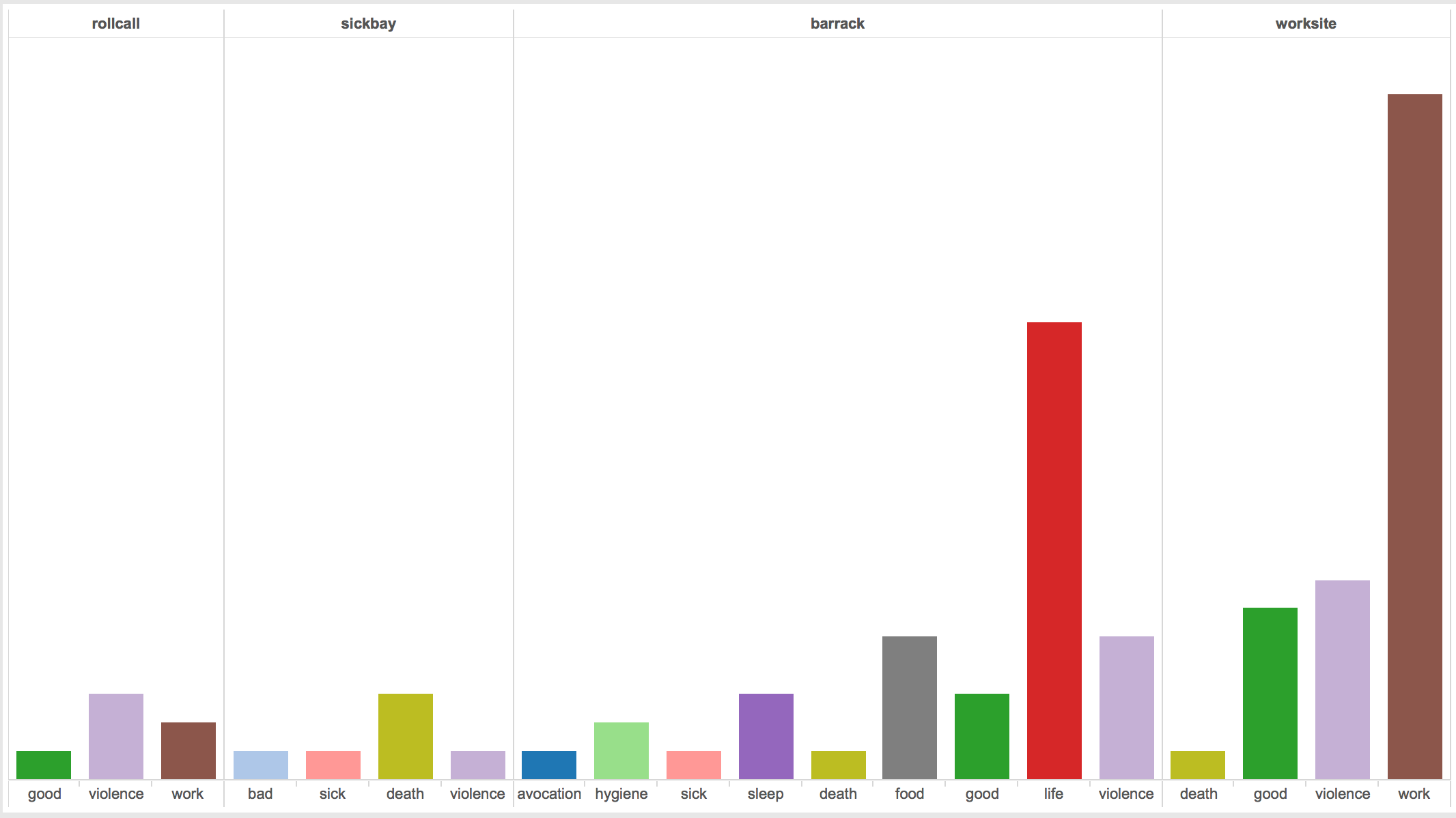
Lastly, the locations of the events were not specific enough to generate a unique latitude and longitude coordinate. Locations were given one of five sets of coordinates that correspond to the Barkhausen camp (as the barracks, sickbay, roll call and bathroom), the tunnel entrance on Jakobsberg (as the worksite for Barkhausen), Lerbeck (which contained all locations), the approximate location of the Hausberge camp (as the barracks, sickbay, roll call and bathroom locations), and the top of the Jakobsberg as the worksite for Hausberge.
I began the process of recording events by making a list of locations and events that I thought would show up in the accounts. My initial list of locations included bathroom, barrack, roll call, worksite, and sickbay; and events like food, work, sleep, life, hygiene, violence, good, death, and sick. The final list of locations and events did not change much. In most cases, determining an event was pretty straightforward. For example, Eva Gescheid frankly described, “we possessed no shoes.” That describes an aspect of life, so easily fits in the life event. The location is less clear. If this is to mean that they had no shoes at all, period, their whole time in the Hausberge camp and adjacent worksite under the mountain, then this event could apply to all locations. In the instances of avocation, food, life and sleep events, I placed all of these in the ‘barracks’ location.
Sometimes the event and location are clear, as is the description of a death retold by Anton Daniel Cornelis van Eijk, a Danish prisoner of war at Lerbeck. “I sat in Lerbeck for six months, and in these six months, so far as I know, two people died.” He then recounts the story of a young Polish man, 28-30 yrs old, who was hanged because he called a camp elder (Lagerältester) a communist. A few prisoners, perhaps Russians, helped with the hanging. Apparently he was not completely dead when they finished, so he was taken to the sick bay where he was given an injection of gasoline which caused him to die. Here both the location and the event are known.
Survivors by age and gender.
In looking at the data, a number of interesting patterns arise, answering many of our questions from above regarding gender. As noted, only 14 interview accounts out of 24 held information that made it into the study. Again, that’s not to say that the other account did not hold important and interesting data, but they did not recount any experiences that related to Porta Westfalica specifically. The number of interviews ended up being pretty evenly split with six female accounts and eight male accounts. This is rather interesting as there were nearly twice as many male prisoners (1,970) as there were female (1,000). Unexpectedly, the number of accounts from the Barkhausen camp (4) is equal to the number from Lerbeck (also 4). With nearly three times as many inmates at Barkhausen (1,300) as at Lerbeck (500), one would think more accounts would come from Barkhausen. Again this points to the limitations of the study, in that a proportionally representative number of accounts from Barkhausen were not available. The average age of the survivors at the time of internment was 25.5 years of age. Two survivors, Dmitrij Iwanowitsch Zwagorskij and Pierre Lecomte did not have enough data to determine their age at the time.
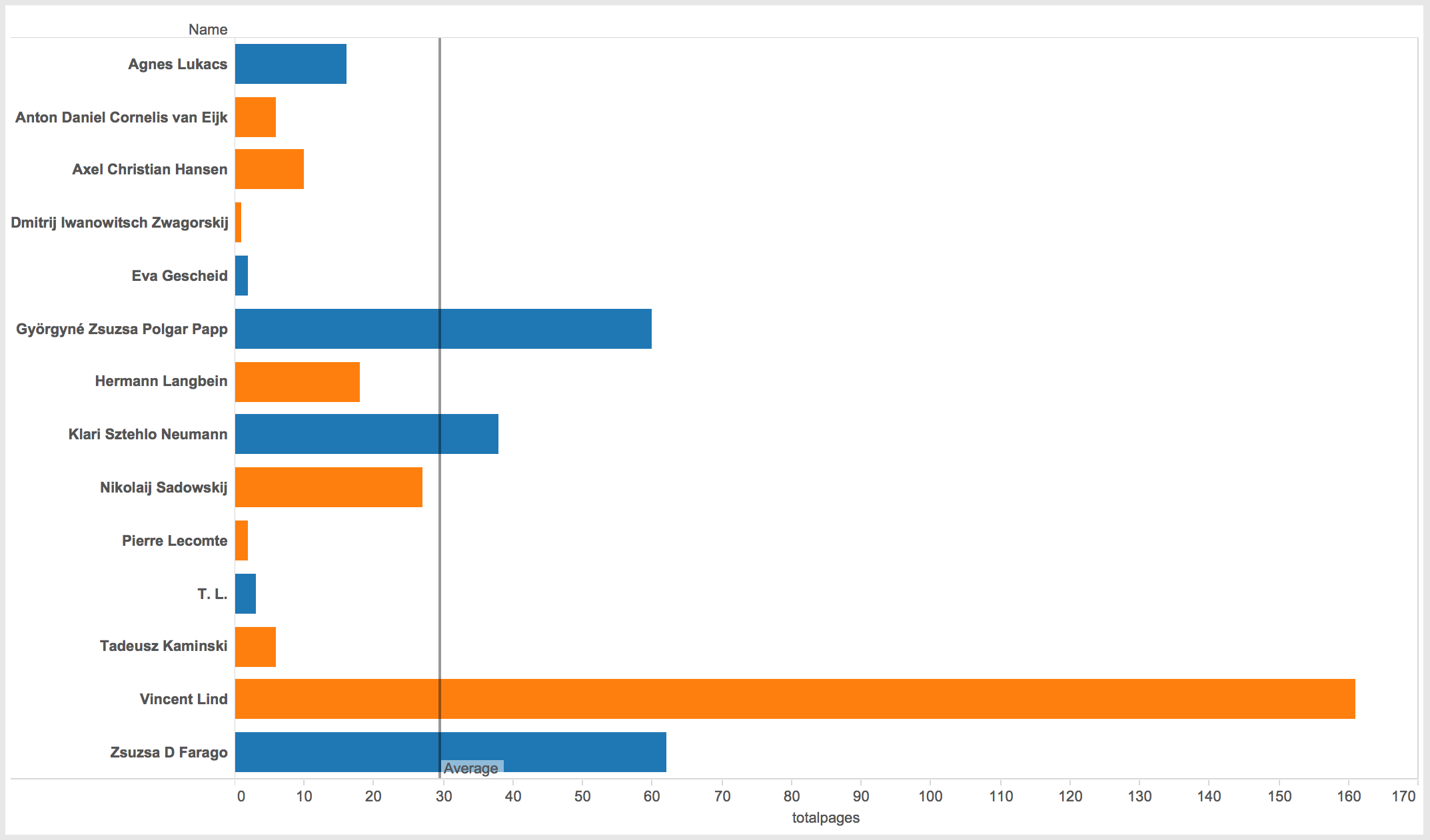
Total pages by survivor.
The total number of pages in each survivor’s account is also telling. Males totaled 229 pages of accounts, while females totaled 181 pages. Each survivor averaged 30 pages of interview transcript, although that number is a bit misleading. Only three individuals actually surpassed 30 pages of interview, three women and one man. Vincent Lind, a 20 year old political prisoner from Denmark, accounts for half of the men’s page count at 161, and by far the most pages of any survivor in the study. Zsusza D Fargo and Györgyné Zsuzsa Polgar Papp, both 24 year old Jewish women from Hungary, had 62 and 60 pages respectively, and Klari Sztehlo Neumann, a 23 year old Jewish woman from Hungary was the final survivor over the average with 38 pages.
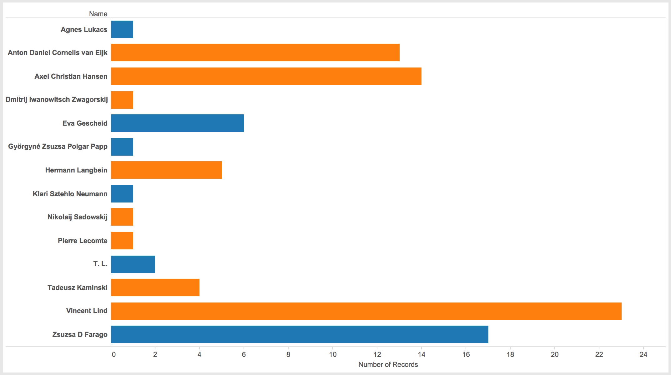
Number of events recorded by survivor.
Comparing total page count with the number of events in the study is also enlightening and somewhat counter intuitive. While Vincent Lind and Zsuzsa D. Farago do indeed have the most number of events represented in the study, Zsuzsa Papp, who had the second most total number of pages, only provided one event to the study. Likewise, Axel Christian Hansen, a 44 year old political prisoner from Denmark, and Anton Daniel Cornelis van Eijk, a 41 year old prisoner of war from Denmark, each contributed 14 and 13 events respectively, while only having 10 and 6 pages of account respectively. This simply shows that the number of pages in the account do not necessarily predict the number of events reported.
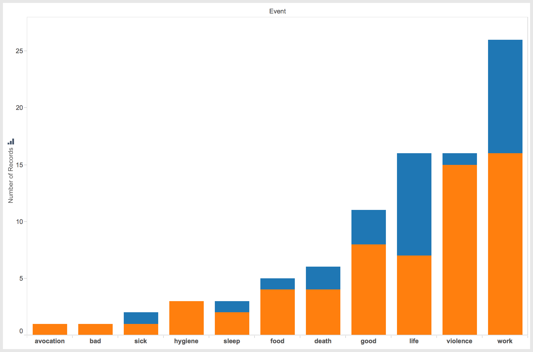
Number of events by type of event.
Looking at the events related by gender also uncovers an interesting dichotomy. While males had at least one record in each event, the female accounts mainly centered around three events: work, life and good experiences.
According to the few accounts available, women spoke predominantly about life in the camp, talked about the work they were forced to accomplish, and related a few good experiences. Interestingly, life experiences only had one less than work experiences, 9 and 10 respectively. This seems to indicate the women were more focused on the work and living conditions while at Porta Westfalica. For the women, only one instance of violence was recorded.
As anticipated, men focused their accounts mainly on work and violent experiences, followed by good and life experiences. Also as expected, 51 events—over half the total number of events—speak of negative experiences, with surprising 11 instances of good events happening. Surprisingly, there were not as many accounts of death as expected. With a higher percentage rate of deaths than the parent camp of Neuengamme, I expected there to be more death events in the accounts than was represented. Vincent Lind and Anton Daniel Cornelis van Eijk provide the only male accounts of death, and Klari Sztehlo Neumann and Zsuzsa Farago provide the two accounts of female death in the Hausberge camp.
Number of events.
Turning to spatial representations of the data show an equal number of interesting patterns. Work events are the most numerous (26), followed by violence and life events (16 each), good experiences (11), and a surprisingly small number of death events (6). Not surprisingly, at the three labor camps, work events are the most numerous.
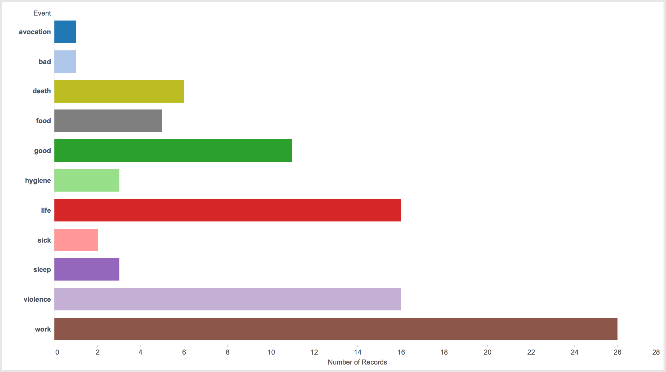
Number of events by location.
Placing these events where they happened provides more insight. As one might expect, most of the work events happened at the work location. Two exceptions are more related to placing events that are really roll call experiences, rather than work experiences in the the work event category due to lack of a roll call event category.
One of the main questions I had was where did the violence happen. I speculated that most violence occurred near the camp rather than at the work site, in that the SS guards would rather their prisoners work and therefore refrain from violent actions. This assumption assumes that most violent actions came from prisoner guards, but in actuality, violence most often came from fellow prisoners, specifically those with some position like the Lagerältester. Indeed, all seven accounts of violence in the work place came from fellow prisoners. Only two cases of violence at the barracks where perpetrated by camp guards. All three violent events during roll call were carried out by SS guards.
An almost equal number of good experiences as violent experiences at the worksite, and to a lesser extent the barracks. The surprising number of good experiences come from three individuals, some describing the beauty of the landscape, some describing positive interactions with other inmates or civilian laborers, or even a positive interaction with a Gestapo officer.
Perhaps obvious, only negative events happened in the sickbay; three deaths, and one each of violence, sick and bad.
The barracks had the most number of different events, most likely allowing to the barracks being the only other place rather than the worksite where the inmates were allowed to go. At the work site, as seen in the graphs, was mostly concentrated on working. The barracks allowed for a larger variety of action.
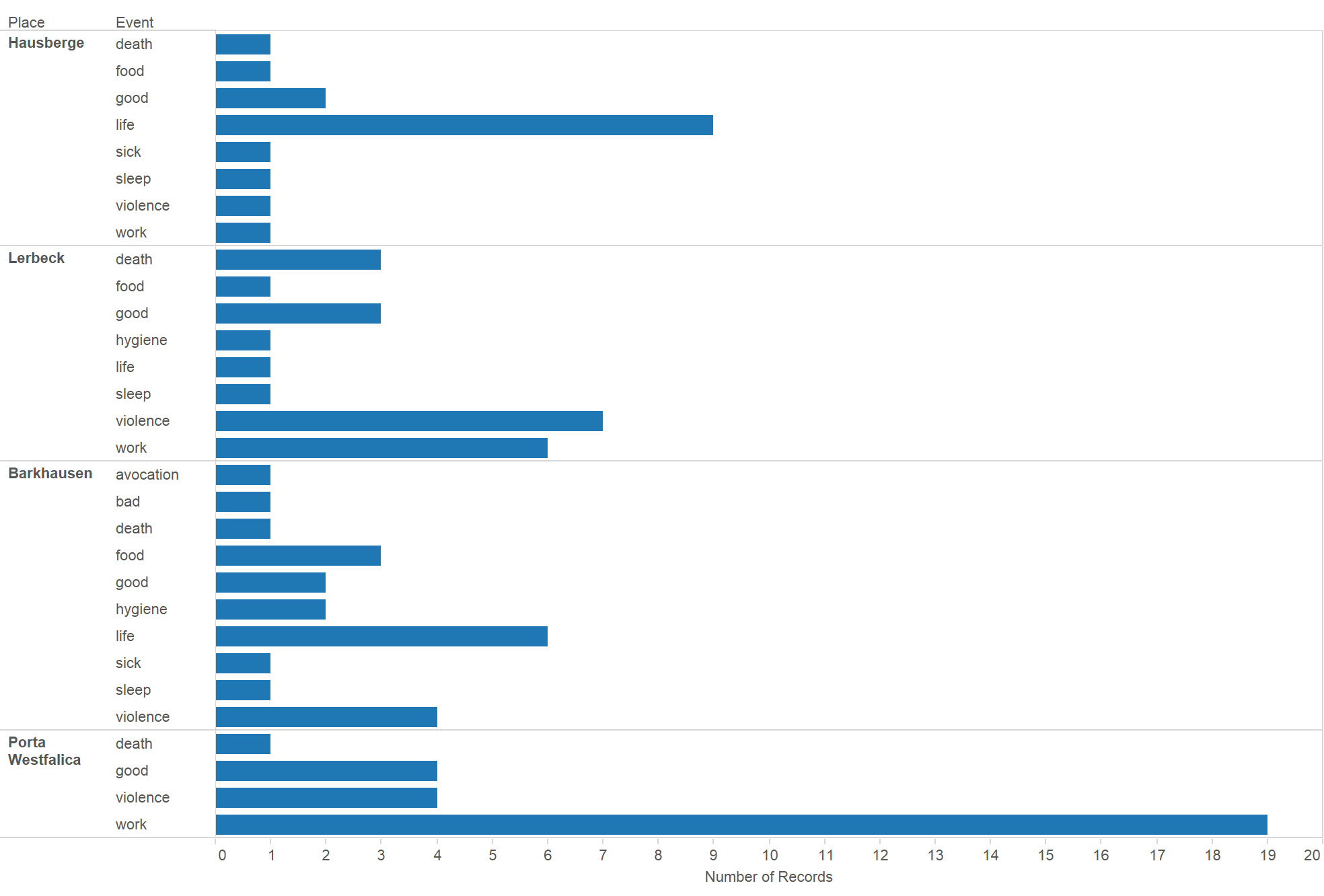
Number of events at places.
Looking at the different camps also shows patterns. Lerbeck had almost double the number of violence than either Barkhausen or Porta Westfalica (worksite), possibly because Lerbeck included living and working conditions, but had less than half as many accounts of work than the work site at Jakobsberg.
Attempts were made at mapping the various events and the location, but due to the small number of locations, the maps do not reveal much more than the graphs.
A further spatial study arose while reading through the interview accounts. Central to all remembrances was the complete circle the survivors made in terms of their journey; from initial confinement to internment and transportation to various camps, and the journey back home. The next spatial project will use Omeka and Neatline to create an interactive journey of several survivors. As the narrative of the journey is told, the locations will be displayed on the map, and visitors will be able to follow along on the map as well as with the narrative.
The project will be hosted at http://nazitunnels.org
One final thought and caution to keep in mind when doing spatial projects with such sensitive and emotional data is that plotting and graphing the data can abstract the humanity from the survivors, as they become dots on a map rather than people. Care must be taken to keep the humanity in these spatial humanities studies.
One way to do that is to always reference the names and use examples of their experiences.
[1] Jodie M. Plumert and Alycia M. Hund, “The Development of Memory for Location: What Role Do Spatial Prototypes Play?,” Child Development 72, no. 2 (March 1, 2001): 370–84, 370.
[2] David C. Rubin, “A Basic-Systems Approach to Autobiographical Memory,” Current Directions in Psychological Science 14, no. 2 (April 1, 2005): 79-83, 80.
There are many, many, many, many web sites, tutorials, how-tos and printed pages written on how to create a website; the proper steps needed, the best way to design, the best place for hosting, and on and on. Well, here’s another one…
Hopefully this reaches a different audience and provides insight and help along the way.
Additionally, this post is part of the dissertation. Of the How, What and Why of the website, this post explains the How. So this post is less a how to do it for you, but an explanation of what I did, as part of the methodological approach to digital humanities section of the dissertation.
Content is King
The absolute most important thing for a website to be relevant and useful is to have pertinent and quality content. Many ugly and difficult to use sites exist and are frequently used because they have important and relevant content. A simple web search turns up hundreds of articles addressing the need to put content first. Links to such articles are almost pointless in that new articles are written constantly. Nevertheless, here is a great article stressing that generally the most important step is to define the content, then create the HTML structure, and then finally design the website. By “content” what is really meant is what kind of content types are used in the website, not finished and edited prose, images or video. “Content” means structure, as argued by Mark Boulton. In reality, “content” influences design, and design influences content, but in general, it is important to know what types of content are to be used on the site first. Below I describe four content types used in the dissertation website.
The basic purpose of a website is not to support the needs of the creator, but to answer the users question. A user comes to a website looking for information or an answer to a problem or question. If that answer is not found, they will go looking elsewhere.
With that thought in mind, I looked at all of the information and content that I have and tried to figure out what the website visitors would most want. The purpose of the site is to be a repository of documents and information about the underground dispersal projects, so that information and those documents are the most important pieces of content.
The site also contains essays (discourses/chapters/treatise/monograph/disquisition/paper, whatever they be called) about German and English morale during the bombing wars, the interaction of German businesses with the Nazi government, the reason why some businesses were moved underground in the first place, a discussion about the merits of a digital dissertation over a traditional written narrative dissertation, a summary and analysis of the underground project at Porta Westfalica, and an analysis of a digital project that maps the location of events for numerous inmates at Porta Westfalica.
Another piece of content on the site are the teaching modules. These modules will help high school and undergraduate German language teachers utilize the primary sources in the repository.
Finally, the repository itself and the documents within are desirable as content.
Through this exercise I formalized that I have four distinct types of content for the site: project information, primary documents, teaching modules, and informative and analytical disquisitions/chapters/essays.
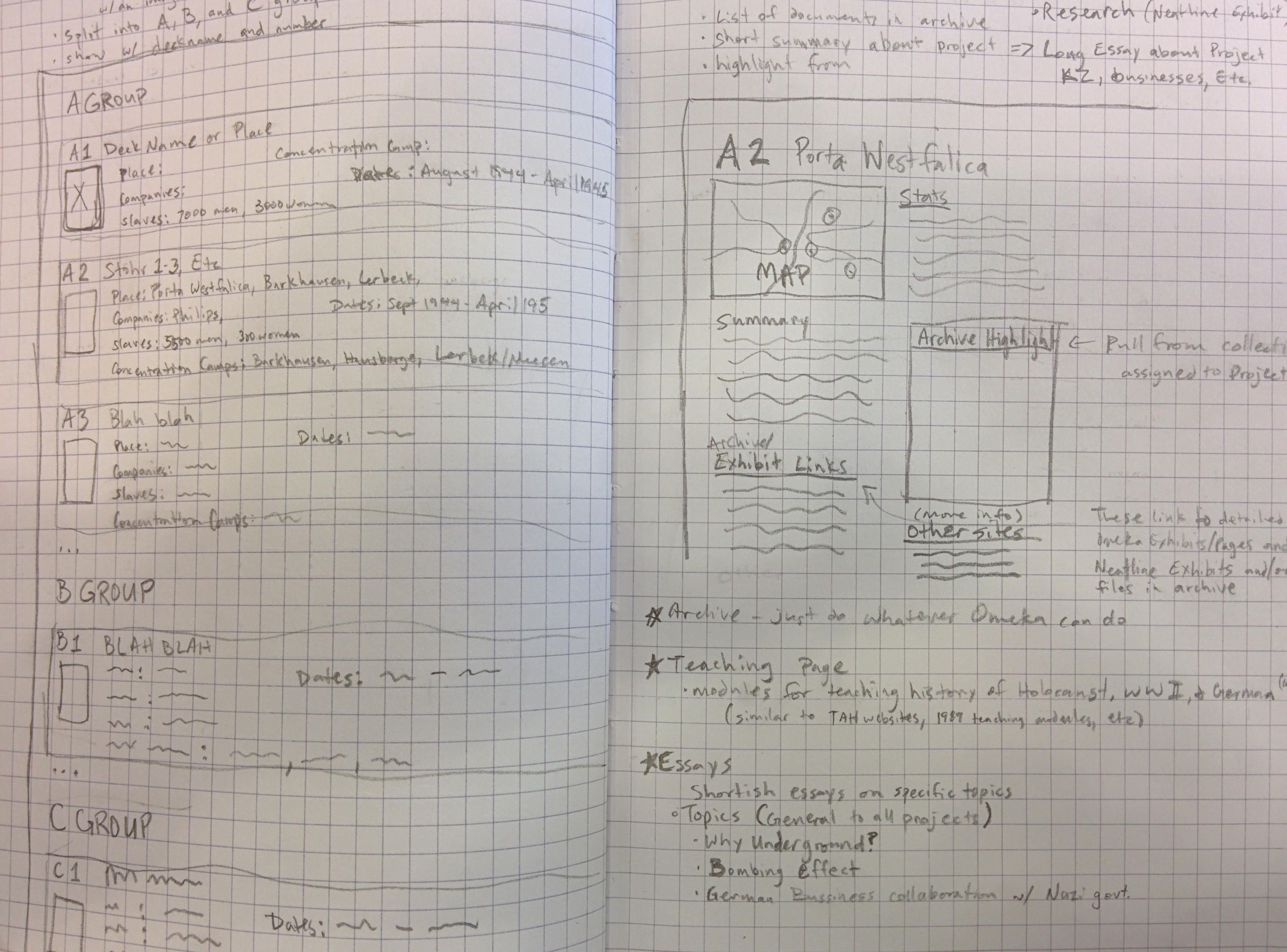
Below is an image of my notebook brainstorming the content, structure and design of the website.
The four content types: Project pages, Repository, Essays, and Teaching Modules.
Audience
Another key factor in designing the website emerged simultaneously with the four content types; the desired content depends on who is visiting the site.
For an example, if I were a high school German teacher looking for a way to get my disinterested kids more interested in learning German instead of throwing spit wads at the ceiling during class, then what I want when I come to the site is a ready made plan for grabbing their attention by appealing to their weird fascination with all things Third Reich (which, honestly, is probably why they are taking German in the first place). If I see a link to teaching modules, I’m sure to click it. If I see some examples of those modules I’ll be even more likely to click through.
As another example, if I am a scholar and I’m looking for documents about underground dispersal projects or letters written by Hans Kammler, then having a link to the repository makes it easy to find what I need. Again, an example of documents displayed on the page is more helpful than a link, and a search box for searching the repository directly is the most helpful of all.
Semantic Structure
Much has changed in the past few years of web development, especially with the adoption of the HTML 5 and CSS3 standards. There are now HTML tags specifically for writing, like: article, aside, figure, and figcaption. When taken seriously, HTML semantics provides for a much better web experience (especially for those using alternatives to web browsers like screen readers for the deaf) by providing a well built structure to frame the content and a scaffold upon which can hang a beautiful design. The above linked Smashing Magazine article does a great job pointing out the desirability of properly structured content.
One can think of the HTML structure of a webpage in the same way one uses an outline of an essay. The structure defines where the content goes. A great resource for understanding the HTML5 structure and elements is found at the Mozilla Developer Network site.
Fortunately, many modern content management systems take care of (or obfuscate) the underlying structure. I will try to influence the underlying HTML that WordPress and Omeka create, but as this is a historical dissertation and not a work about web standards, the end result will be something less than perfect semantic markup.
Design Matters
The way a website looks matters. Designs can make it easy or difficult to find the content. Sometimes design elements get in the way and distract from the content. There are many sites and articles dedicated to teaching you how to design a website. Companies have been formed with the goal of instructing you how to build and design websites. One favorite instruction site has been tutsplus.com which has instructions for almost anything computer related. A great online magazine that deals with modern designs in websites is the before linked Smashing Magazine. There are many, many others.
Wireframes
Any easy way to get a sense of how the different components and content types fit together is to create a wireframe. A wireframe is a very rough sketch of the website just to show how the components fit together. They may or may not include actual pieces of content. Often they contain filler text and filler images. As the name implies, wireframes are a barebones outline of how the website components fit together, much as a sketch for an artist precedes the painting.
There are many software options available for creating wireframes, each with advantages and learning curves. As a matter of practice, I used the online tool, MockFlow. The easiest method for creating wireframes is using good old paper and pencil.
I used paper and pencil or the very rough sketching, and MockFlow for a bit finer detail and included some actual content.
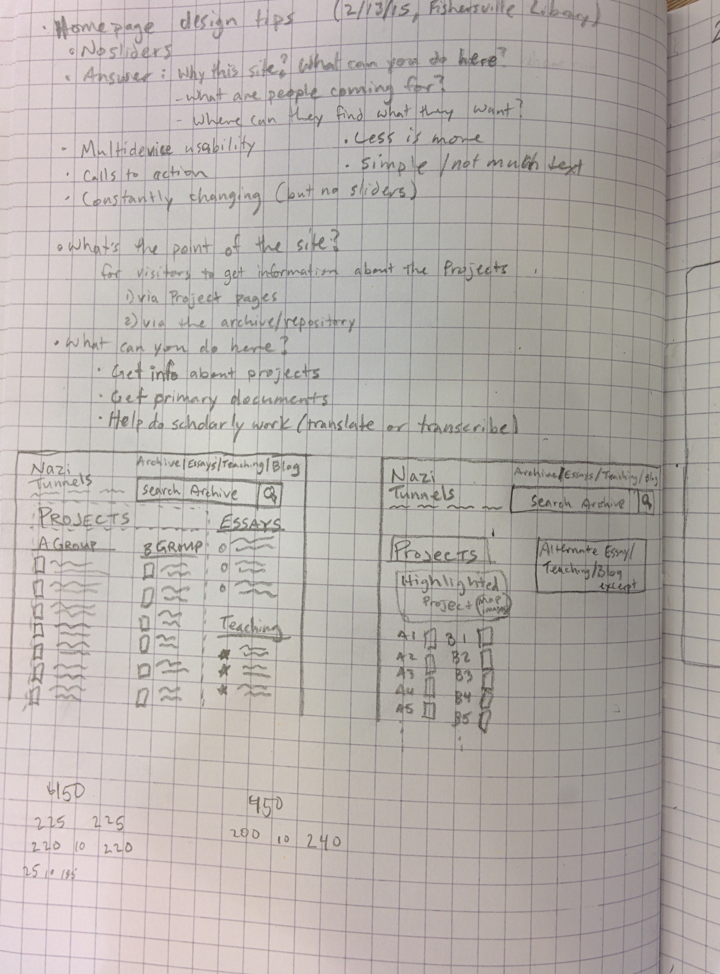
Notes for good home page practice, and some ideas.
Ideas for the home page, and notes about the site.
The four content types: Project pages, Repository, Essays, and Teaching Modules.
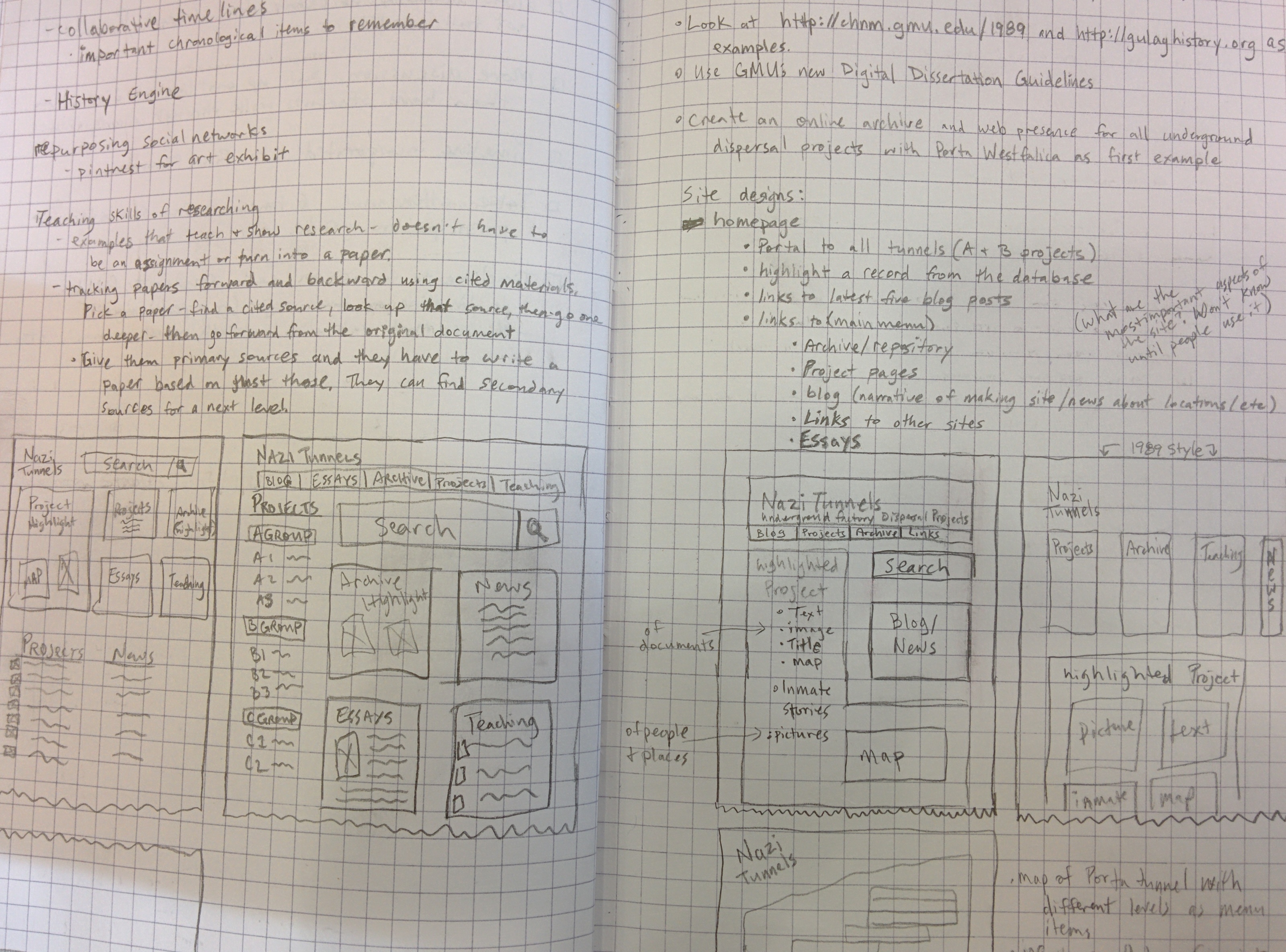
Idea for a general projects page.
Idea for an individual project page.
Idea for the home page.
Navigation
Getting around the site is crucial. If a website is like a maze and clicking on links leads to loss of bearings and confusion, visitors are less likely to continue using your site and may not come back.
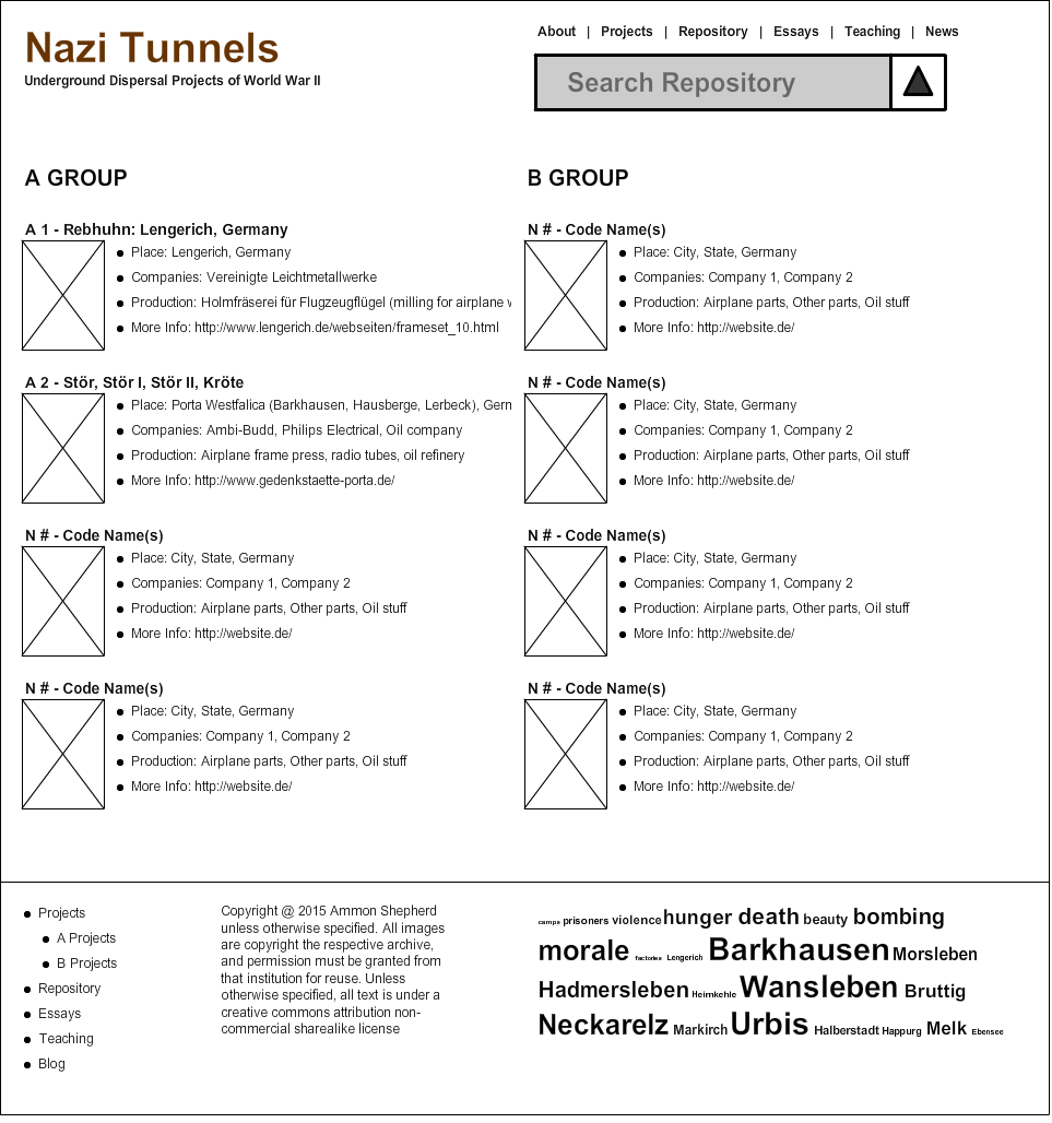
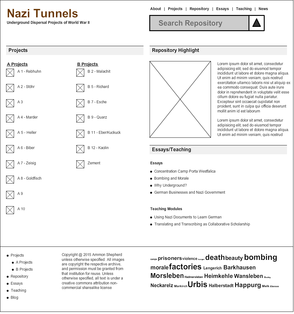
This site design has navigation at the top of the page that will remain in place no matter what page is being visited. Main navigation links are also found at the bottom of the page in the footer. These menu items link to the four content types; projects, repository, teaching, and essays, with links to the home page and blog/news section as well.
One goal for this site is to have all desired content available within three mouse clicks. That is, no matter what page I am currently viewing on the website, I should only have to click on at least three links to get the content that I want. The top and bottom navigation menu makes it possible to get to the four main content pages with one click. A second click brings me to an individual project page, a specific disquisition (essay), or a lesson plan. Similarly, using the search tool allows me to view a list of repository items in one click, and view the item (if the item is on the first page of results) on the second click.
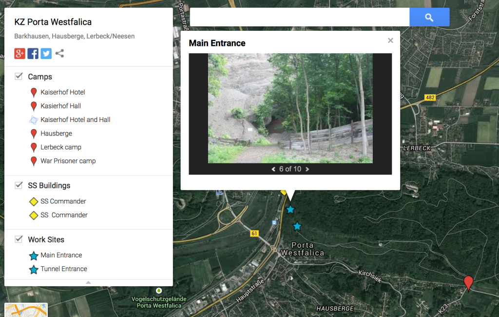
I needed to get the latitude and longitude of several places for the GIS project. I used Google Maps to get the data. Just click on a point on the map and the info box shows you the lat/long.
While playing with this, I figured I’d make a more permanent map showing some of the important locations. That map is found here:
This site has a great tutorial for using GhostScript to convert a PDF into PNGs suitable for using for OCR. They do a great job explaining the different flags for GhostScript and some tips for getting the best resolution for the PNGs. The one step they don’t show is how to get each page of a PDF into a separate PNG (so a 10 page PDF makes 10 PNGs).
Here’s how to do that:
In the output image name, add: %03d
This will insert an automatically incremented number padded with a padding of three digits. That means the first number will be 001, then 002, then 003, and so forth. This is really helpful in keeping the files in alphabetical and numerical order. Otherwise you’ll get a file ending in 11 coming before 2.
1. If I have a scanned copy of files in PDF form I run the above GhostScript command. This results in a folder of PNG images.
2. I run a new watermark/OCR tool on the folder of images. It is a Ruby script which utilizes ImageMagick for creating a watermark and Tesseract for running OCR on the images. You can find this program here:
This creates a folder called ‘output’ with a PDF of all the images (kind of redundant when starting with a PDF, but now the pages have the watermark on them), and two sub-folders, one with the OCR files, and one with the watermarked copies.
3. Now I can get rid of the PNGs that were created with the GhostScript command.
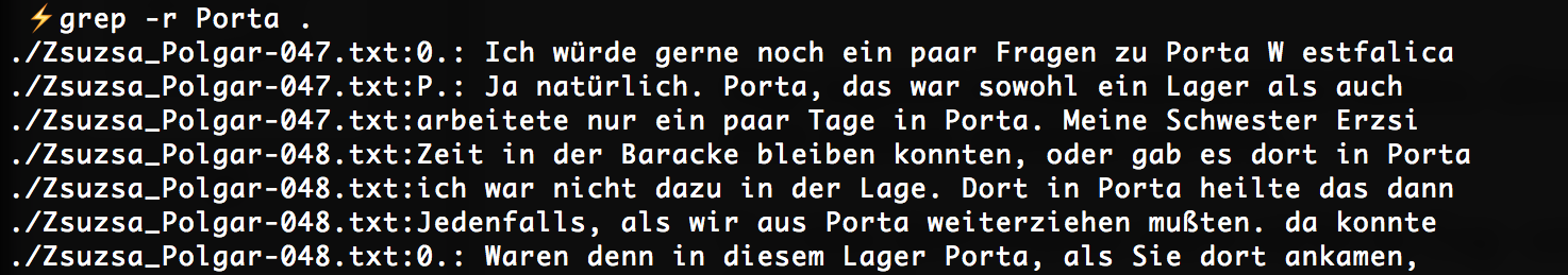
Now that I have each page OCRed, I can do searches on these files, where otherwise I had to read through the entire PDF page by page. For example, today I’m looking through a 40+ page PDF transcript of a survivor interview to find the parts where she talks about her experiences at the Porta Westfalica camp. While I’ll read through each page, to get a sense of where I should be looking I can now do a search on the OCRed pages to find out where the term ‘Porta’ is found.
Now I know that at least on pages 47 and 48 is where I’ll find some description of her time in Porta Westfalica.
The problem is that there were nearly 300 files to copy, and so I left the laptop to do the copy. In the meantime, it went to sleep, stopping the copy. Scp is not smart enough to just copy the files that didn’t get copied, but will copy all nearly 300 files again.
There is a program that has this intelligence, though… rsync !
The –inconv option allows Mac and Linux to speak the same UTF-8 language.
Special thanks to Janak Singh for the rsync option and detailed information on the issue.
Update: December 9, 2014.
There were some issues with the umlauts on the Linux server, and with the names of the files as I put them into Omeka, so I decided to do away with the special characters altogether. But how to change all of the file names? Easy, use the rename command.
On the Linux server it was easy as:
rename ü ue *.png
on the Mac I needed to install the rename command with homebrew first:
brew install rename
The syntax is a little bit different on the Mac:
rename -s ü ue *.png
You can also do a dry run to make sure it the command doesn’t do something you don’t like.
I have been reading up on Geographical Information Systems/Sciences. There seem to be a number of flavors of combining history with maps and geographical data and methodologies. The various terms I have run across are Historical GIS, historical geography, cultural geography, spatial history or spatial humanities.
Here are the list of books I would like to tackle, with the first two being the most important for my research.
Knowles, Anne Kelly, Tim Cole, and Alberto Giordano. Geographies of the Holocaust. Bloomington: Indiana University Press, 2014.
Gregory, Ian, and Paul S Ell. Historical GIS: Technologies, Methodologies, and Scholarship. Cambridge; New York: Cambridge University Press, 2007.
Black, Jeremy. Maps and History: Constructing Images of the Past. New Haven: Yale University Press, 1997.
Bodenhamer, David J., John Corrigan, and Trevor M. Harris. The Spatial Humanities: GIS and the Future of Humanities Scholarship. Bloomington: Indiana University Press, 2010.
Daniels, Stephen, Dydia DeLyser, J. Nicholas Entrikin, and Doug Richardson. Envisioning Landscapes, Making Worlds: Geography and the Humanities. Milton Park, Abingdon, Oxon ; New York: Routledge, 2011.
Dear, Michael J. Geohumanities: Art, History and Text at the Edge of Place. London: Routledge, 2011.
Gaddis, John Lewis. The Landscape of History: How Historians Map the Past. Oxford: Oxford University Press, 2002.
Hillier, Amy, and Anne Kelly Knowles. Placing History: How Maps, Spatial Data, and GIS Are Changing Historical Scholarship. Redlands, Calif: ESRI Press, 2008.
Knowles, Anne Kelly, and Amy Hillier. Placing History: How Maps, Spatial Data, and GIS Are Changing Historical Scholarship. Pap/Cdr. ESRI Press, 2008.
Pickles, John. A History of Spaces: Cartographic Reason, Mapping, and the Geo-Coded World. London: Routledge, 2004.
I also started working through some of the interviews to pull out locations. This required me to first figure out what I was looking for. I decided to look for eight specific “locations” and map those on a map of the camp. My goal is to see if where these events happen influence why they happen. Or if there is any correlation or outliers after mapping the data.
I had a neat idea while reading one book: visualize what people knew geographically during a certain time. So the map represents the lands and info that a person/people knew about. Say a person from 1820’s England. Their “map” of the world would include Europe, eastern US, maybe a few other countries, but exclude Antarctica?, Irabian peninsula?, Madagascar?, Thailand?, India?